First Republic bank
fintech (2018)
Fintech | 12 week sprint
First Republic Bank’s Corporate product had not been touched in over 15 years and was built on tech soon to sunset.
My Role
When a product brings in billions, but looks dated, the quick answer is “update it”. My role for this product was to actually shape brand and product identity, but the core was fixing multiple UX issues.
This massive project needed someone to roll up their sleeves for everything from what’s not working, where it could go, and what was possible—all in a race against the clock in order to keep users active as we transition backend tech seamlessly.
Before
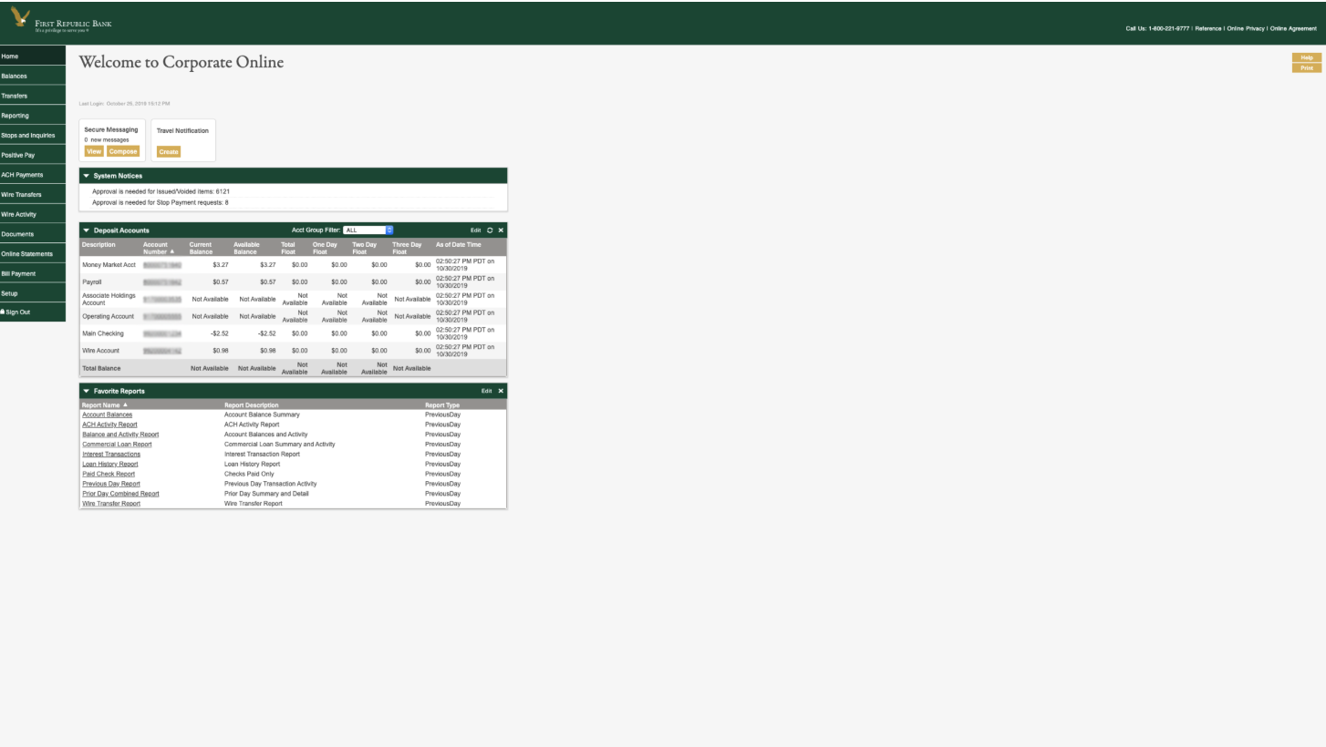
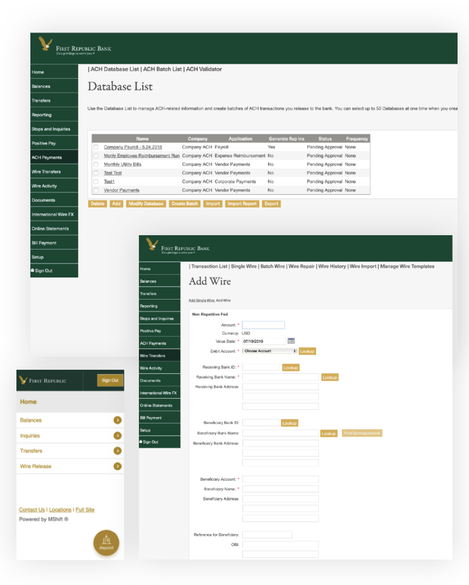
No separation of tasks, status, or actions needed
Side panel of features most companies didn’t need
Difficult to read; eye fatiguing for users needing to complete work tasks like money movement, payments, or invoicing
Key flows, like transfers, unclear
UX copy confusing; financial jargon, inconsistent from industry usage
Process
With First Republic Bank looking to differentiate their Corporate platform, I worked with the product team to stop thinking about our immediate competitors and focus on our current and potential clients.
I gathered everything from industry, company size, to learning about their needs from the C-suite down to the power user day-in and day-out.
For our brand reinvention, I surveyed all kinds of materials, collateral, and print material to see what’s been done since ’85 — and what I could bring into this decade.
While the “look and feel” was a big driver for C-Suite, I looked into what made this product successful as-is. Along with a brand refresh, there were improvements needed in order to truly make a lasting impact.
Discovery
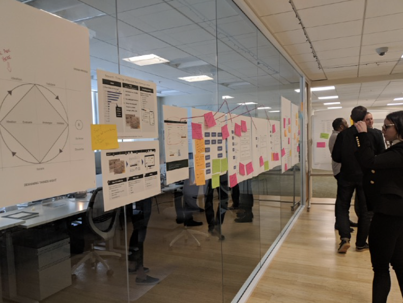
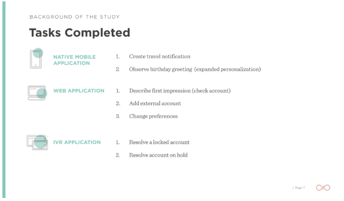
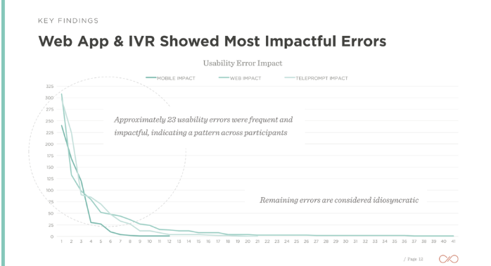
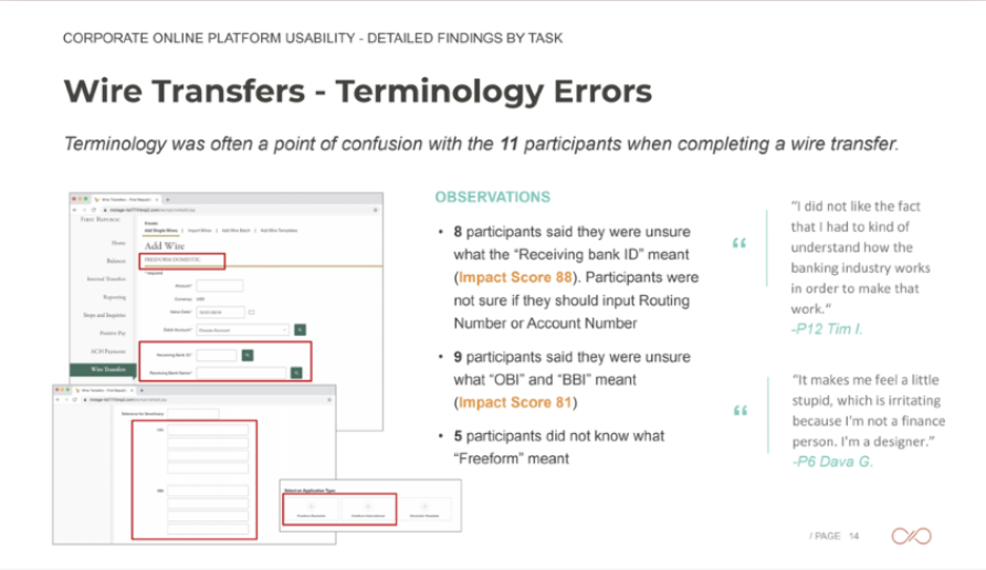
I conducted a baseline usability study. Of the existing, expected workflows, many were so complicated that it it bogged down helplines and prevented users from successfully completing the only task they had to do.
I noticed that users often say what they don’t mean: they loved the idea of having so many features at their disposal — but never actually used or needed them. Our clients expect concierge service and have direct lines to their bankers if anything is less than perfect.
Just like a 10-page menu at a restaurant, more isn’t better. A good product is efficient, useful, and thoughtful. When these align, the table is set for a beautiful, inspired visual design.
Baseline Usability study
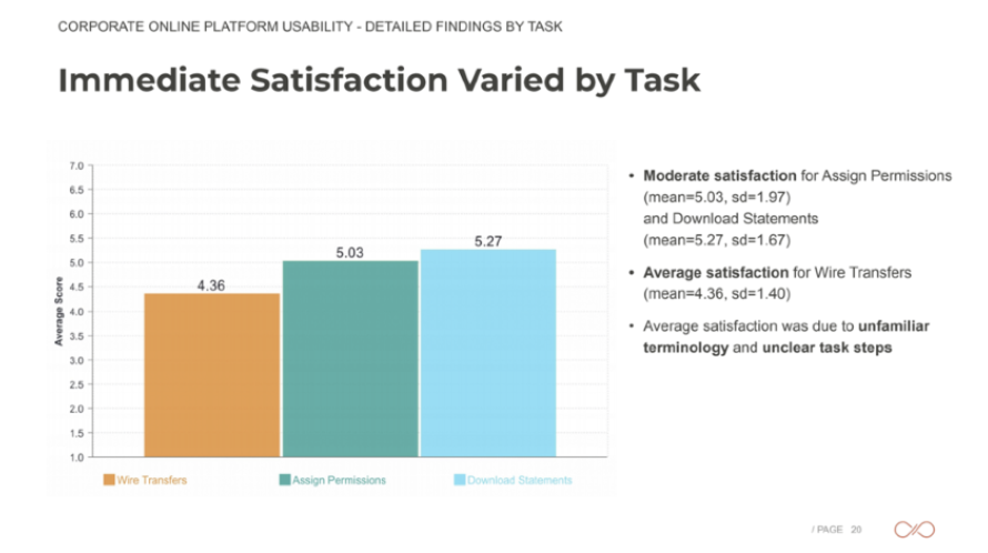
Since Corporate Banking is complex, I wanted to find out where our existing product could improve.
Key Finding: Some tasks were fine from a technical perspective, but had banking jargon that confused most users. Not all improvements would be overhauling a flow or a feature.
Personas (Role Based)
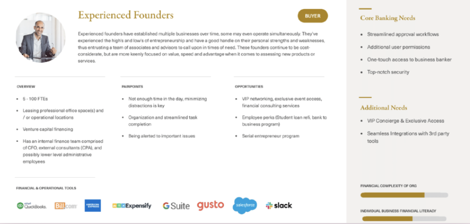
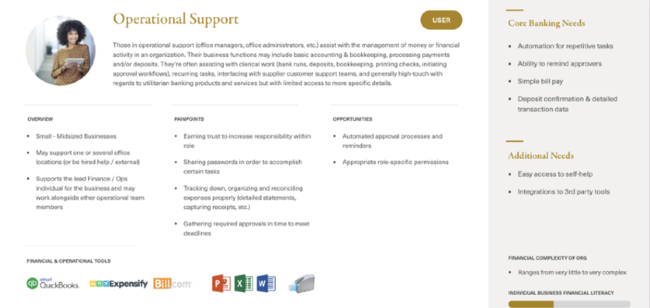
Rather than have the traditional personas, it made more sense to break down our users by their role, industry, and banking needs.
These are a few of our key users.
Visual x Experience
Understanding our clients’ UX and visual needs were one-in-the-same. Match our white-glove service, while also meeting our clients at their busiest: at work. Be timeless, but not distracting.
I met with clients, conducted interviews, hosted working sessions, and pared down this product from endless features to thoughtful experiences.
As I envisioned the experience, I also baked in future concepts like add-ons, tiering, company sizing, and cross-sells to ensure growth and product market fit.
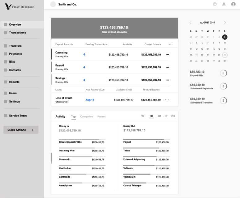
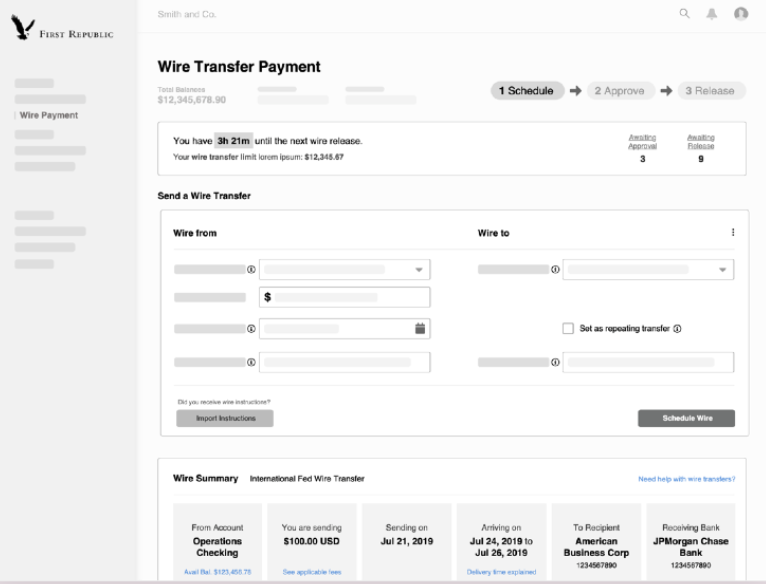
Wireframes
I explored where we could cut out the complexity, and how our competitors missed delightful opportunities
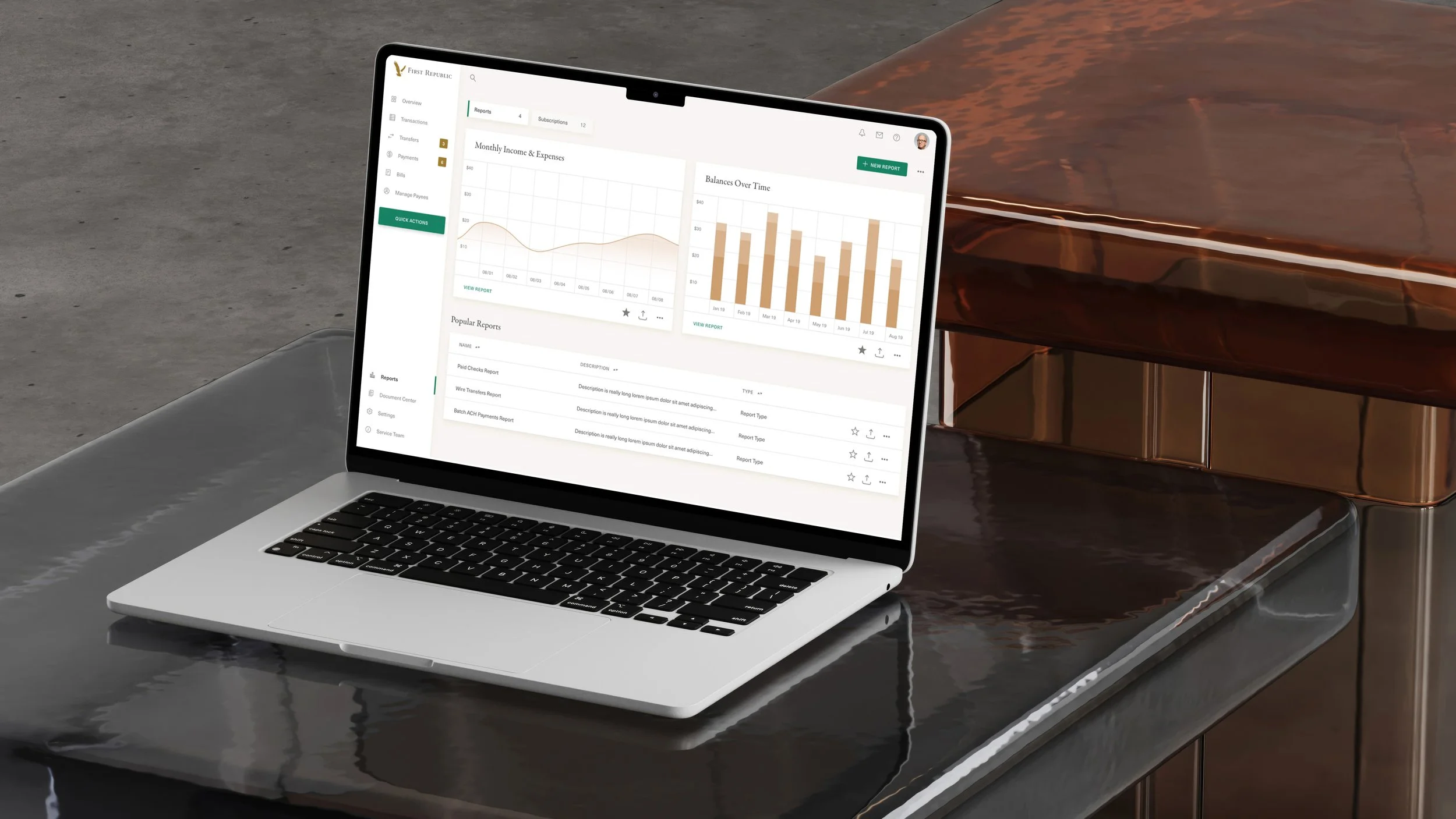
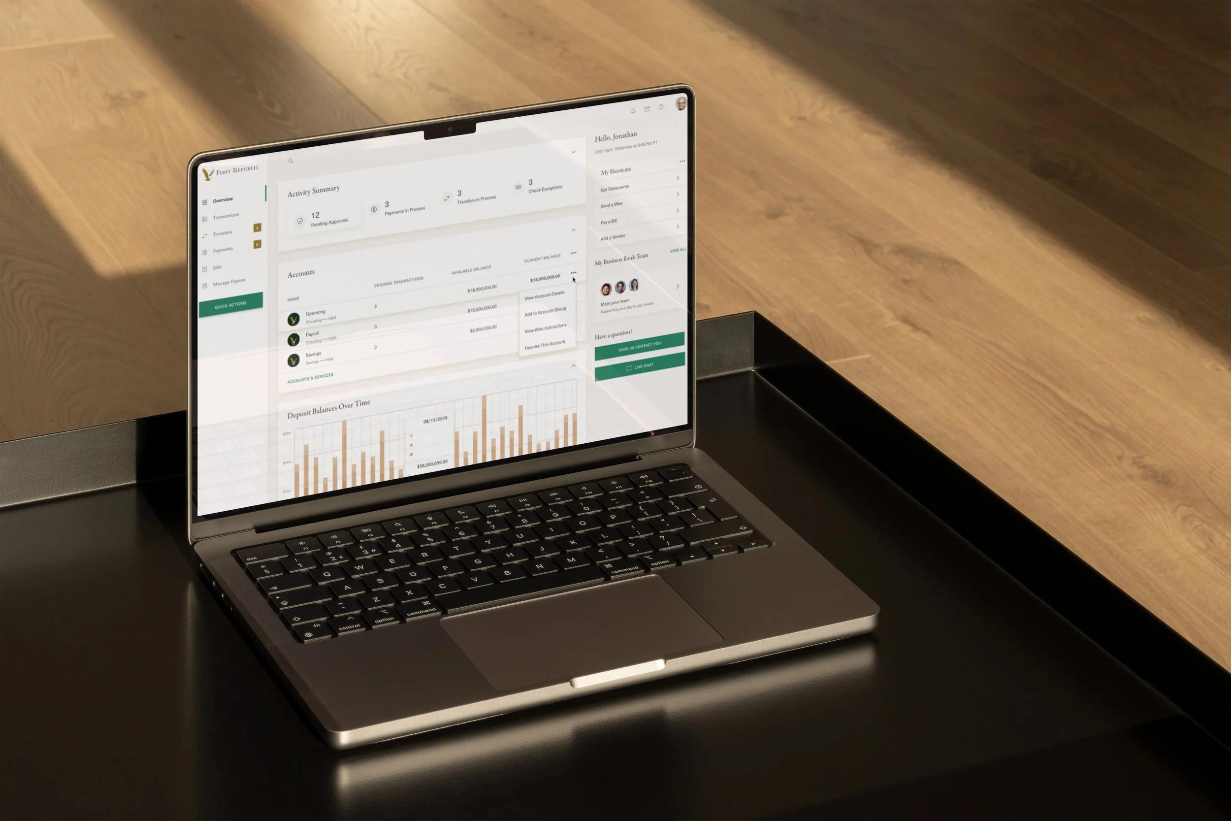
After
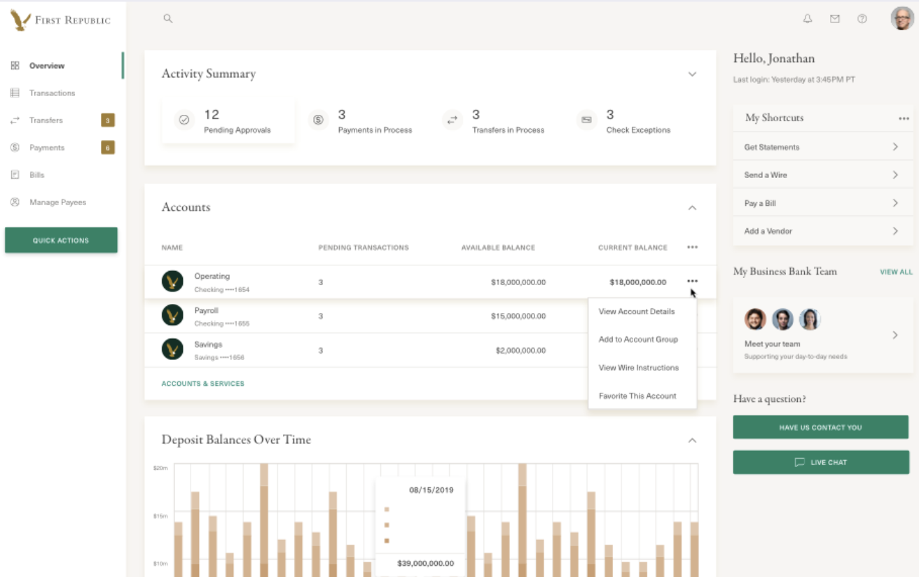
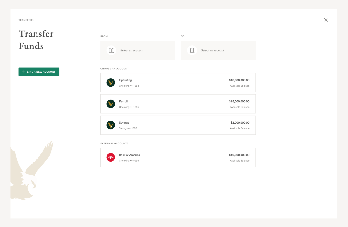
Clear flows & actions
Separated areas depending on action required
User controls, from approvers to viewers
Improved readability, usability for users completing critical tasks
Reinvigorated brand, integrations & data visualizations added
Results
I reimagined a dark and heavily green brand into a white-glove Corporate Banking experience.
In the 12 week sprint, encompassing research, strategy, UX, and visual identity, I pushed the boundary on what our Corporate product does well, and set the precedent for First Republic expanding its product suite in style.
We began build and initial rollout to target groups we were interested in gaining traction in.
Of the new clients and trials of this product, results showed great satisfaction, a drastic reduction in support or direct-line calls, flow completion, and overall referrals to similar companies.