

A Unique Banking Platform
Redesigning a Billion-Dollar Legacy
My Role: Lead Product Designer
Team & Scope: 1 PM, 1 UX Researcher, 6 Engineers
Timeline: 12-Week Sprint (Research, Strategy, UX/UI, and Design System Handoff)
Key Business Outcomes:
$45,000,000+ successfully transacted during a 30-day target pilot.
Drastic reduction in direct-line calls to relationship bankers.
100% conversion rate among skeptical Startup & VC target accounts shown the platform preview.
Context
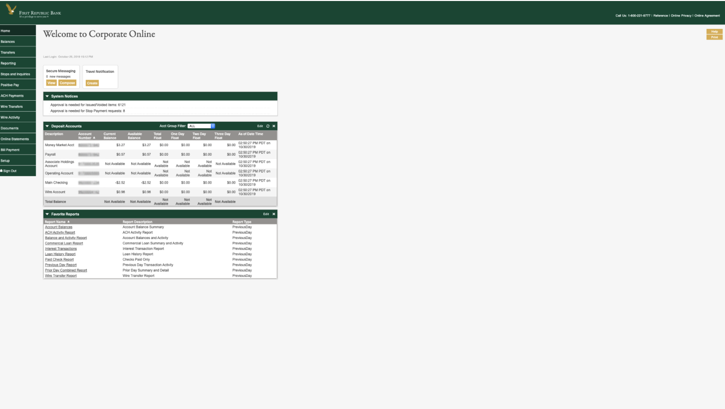
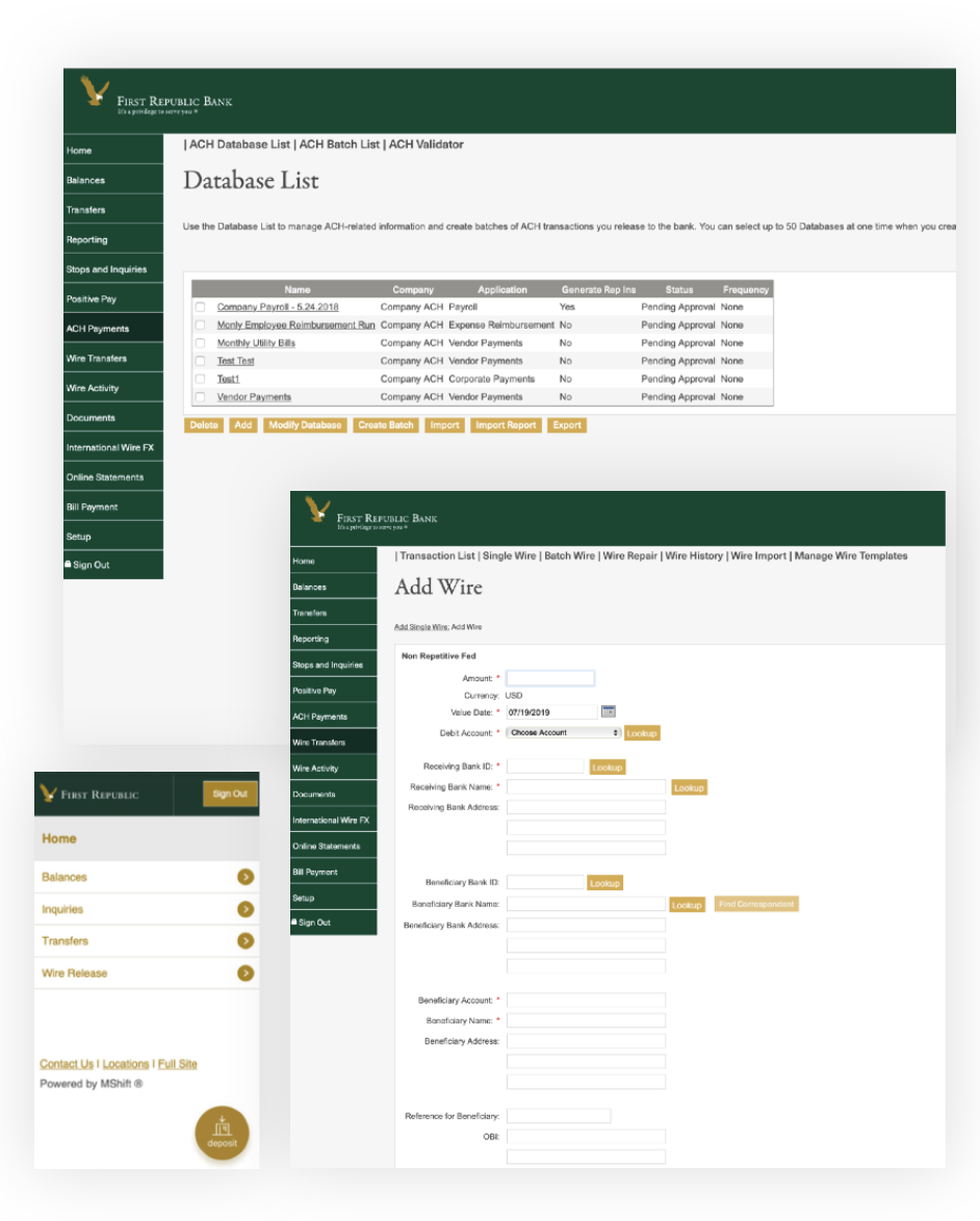
First Republic Bank built its legendary reputation on high-touch, "white-glove" concierge service. Corporate Banking was anything but: new verticals didn’t trust it, and current users would rather call bankers to complete daily tasks than figure out this complicated product.
I joined the team from Consumer Banking and was given simple instructions: give Corporate a 'little lipstick' and it will be all better.
as ugly as it was broken.
The Backstory
1. Feature Rot & Bloat:
Rushed vendor timelines over 15+ years had created side panels full of tools (e.g., Wire Repair, Positive Pay) that 90% of companies never used and never needed.
2. Wasting Banker Time
Workflows were so complex and laden with internal banking jargon that clients gave up and called their bankers to perform basic tasks manually.
Bankers were spending all day acting as data-entry reps rather than relationship managers.
3. Growth Killer
Executive leadership was eager to acquire fast-growing Innovation verticals (Startups & VC firms), but the dated, eye-fatiguing interface was an immediate dealbreaker for modern financial teams.
When these teams gave it a try, it revealed to be as ugly as it was broken.
The Opportunity
I made the case to leadership that this backend technical debt migration was our single greatest opportunity to streamline the product, fix broken workflows, and position First Republic to capture modern enterprise accounts.
Verticals like Startups and V.C.s were on Leadership’s mind, so this was a great opportunity to design for their needs. They approved a research initiative to dig into the current product pitfalls.
Baseline Usability
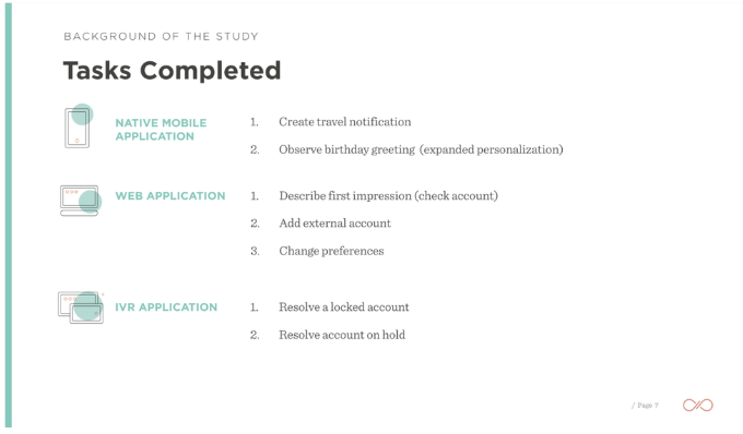
Partnering with our UX Researcher, I conducted a baseline usability study across current clients and prospective enterprise teams.
Key Insights:
Broken basics: Outdated language, unnecessary requirements, and poor money-movement tools forced users to bypass the product entirely.
Over-reliance on support: Instead of tackling complex workflows, users called bankers to do tasks for them.
Fragile workarounds: Users documented their own hacks, terrified that losing key staff would completely halt business operations.
User Roles:
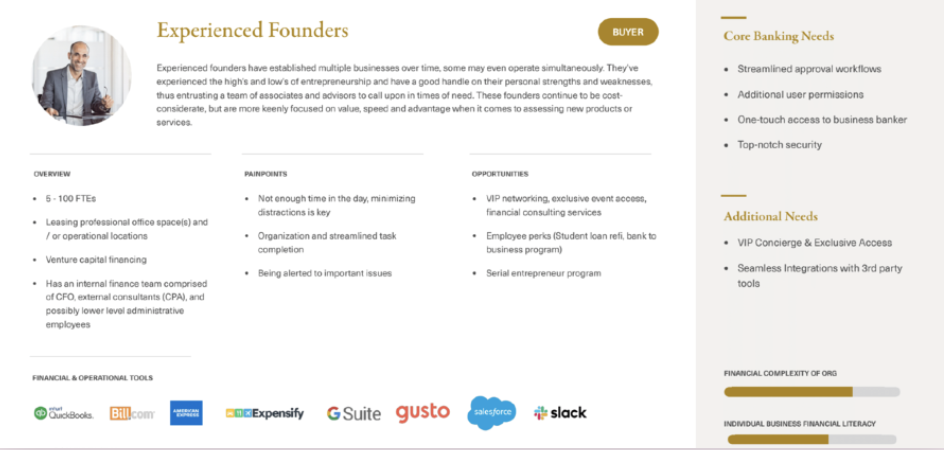
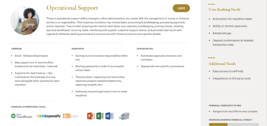
I wanted to know how different organizational roles, permissions, and verticals operated in our product. Overall, the main trends were:
The Executive / Approver (CEO / CFO): Needed rapid cash visibility, high-trust payment approvals, and clear audit trails without getting bogged down in granular operational clutter.
The Power User / Maker (Staff Accountant / Controller): Needed fast, reliable execution for repetitive tasks like batch transfers, ACH, payroll, and document retrieval without confusing compliance jargon.
Bringing It Together
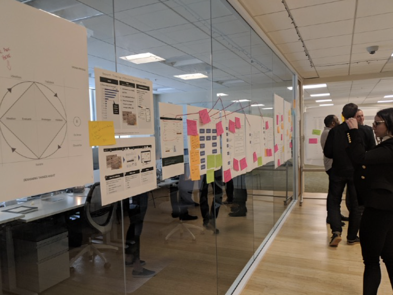
Armed with research and leadership’s approval, I led sessions with the product team to align on the goals.
Rather than keep the same problems, the conversations were to align on what we want, what our customers want, and meet the goal of migrating to the new tech.
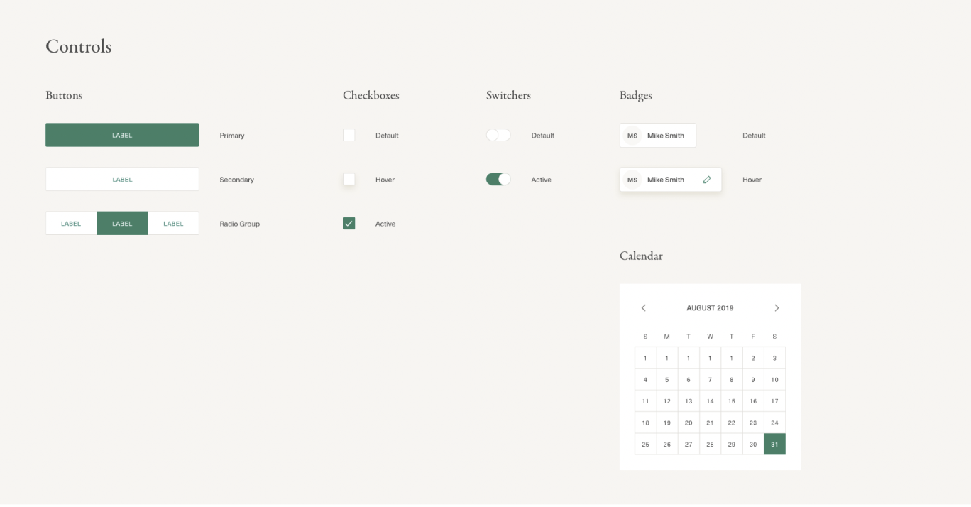
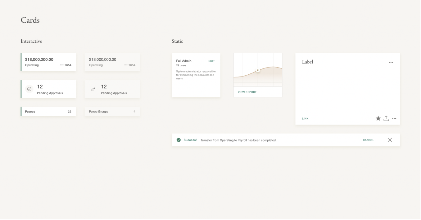
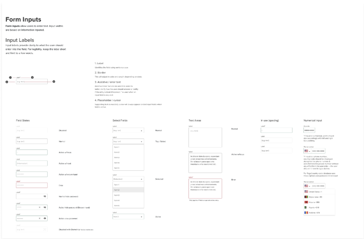
Design System: Creating a Family of Brands
I wanted to give Corporate Banking the system it deserved.
Thinking about our Consumer Design System, I wanted these two to come together in the best moments, but stay true to their differences.
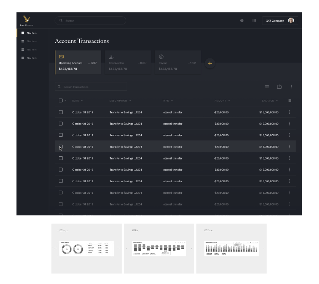
Visual Design
Fixing the Eye Fatigue
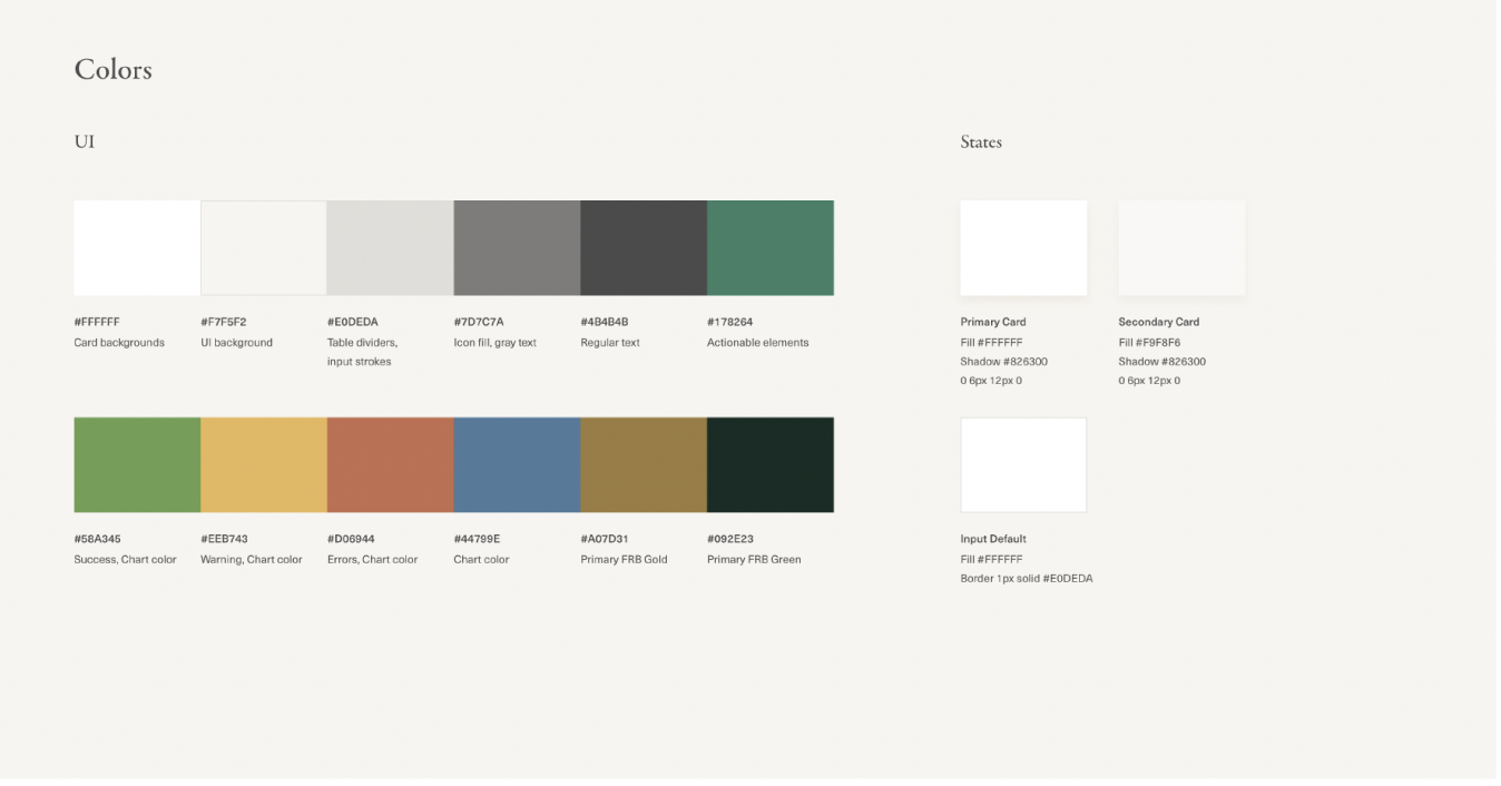
A major issue with the existing product was the brand colors — born from an age of print materials and applied with an appetite for “the more green, the better”.
Not only was this an accessibility issue with the brand green and gold, this was a challenge because the Marketing & Brand teams were sensitive to change.
I worked with them to update our colors and establish guidelines for when we need to balance utility and confidence.
Explorations below are how I approached working with this team to create a product that honors transacting, readability, and utility at its core.
Visual Design Explorations:
Moments for when we lean into our brand and when our users need to focus on critical tasks.
Key Transformation Highlights
Information Architecture
Before: Bloated sidebars packed with unused vendor tools and ad-hoc features.
After: Modular navigation prioritized by actual role utility, focusing on Money Movement, Documents, Invoicing, and Permissions.
Task & Action Structure
Before: Confusing layout with no separation between pending actions, required approvals, and completed history.
After: Clear Maker vs. Approver workflow views featuring explicit status badges and actionable task queues.
Content Design
Before: Heavy internal banking jargon and unnecessary compliance input fields.
After: Industry-standard plain language aligned with modern fintech mental models.
Visual Identity & Design System
Before: Heavy dark green layouts that caused visual fatigue during extended daily use.
After: A crisp UI with generous whitespace, subtle gold accents, and clean data visualization. A nod to our brand’s past, but reinvisioned.

Results
Key Screen
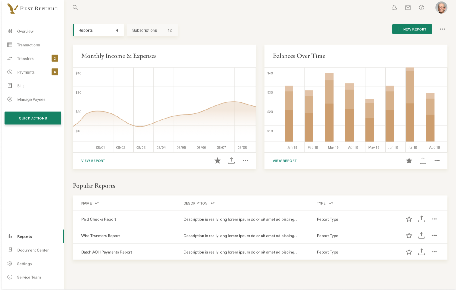
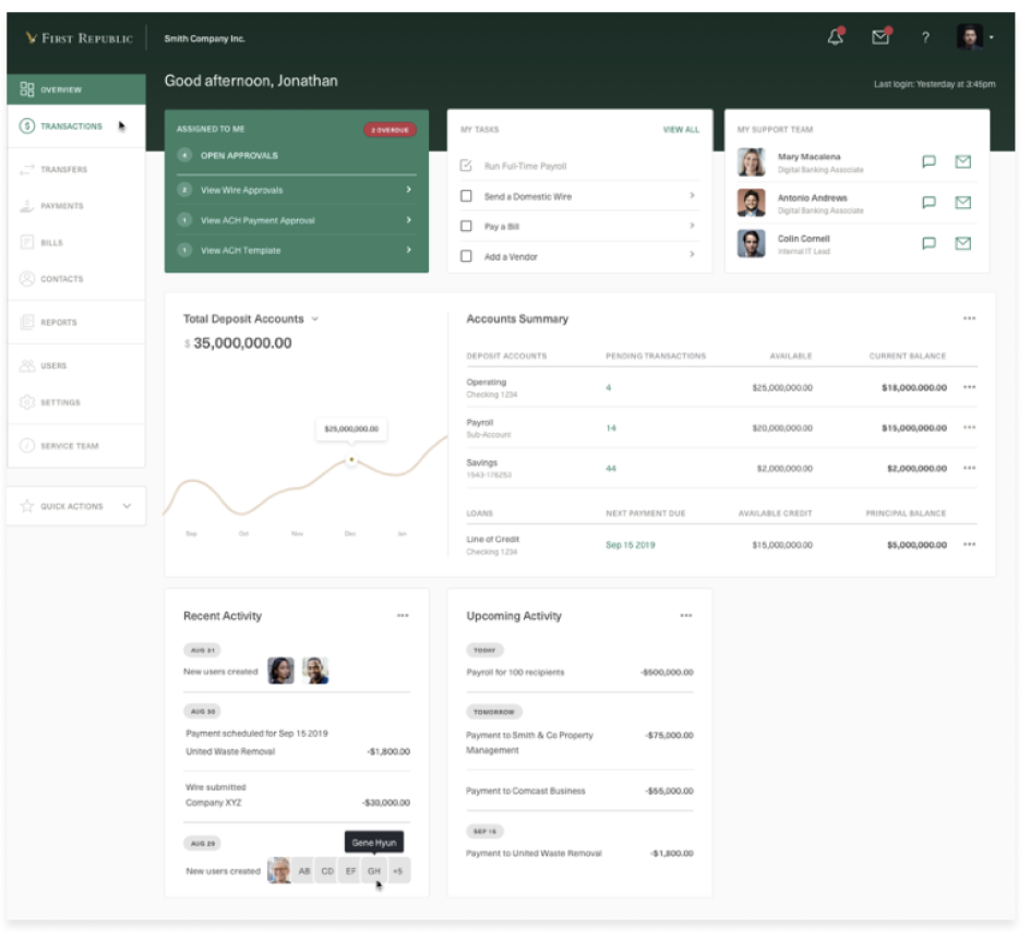
Dashboard
Design intention:
Personalized to usage & roles: get a snapshot of what’s most important to your day
Shown: C-suite Dashboard showing at-a-glance visualizations and key reports
Streamlined IA for quick access to tasks and core banking needs
Key Screen
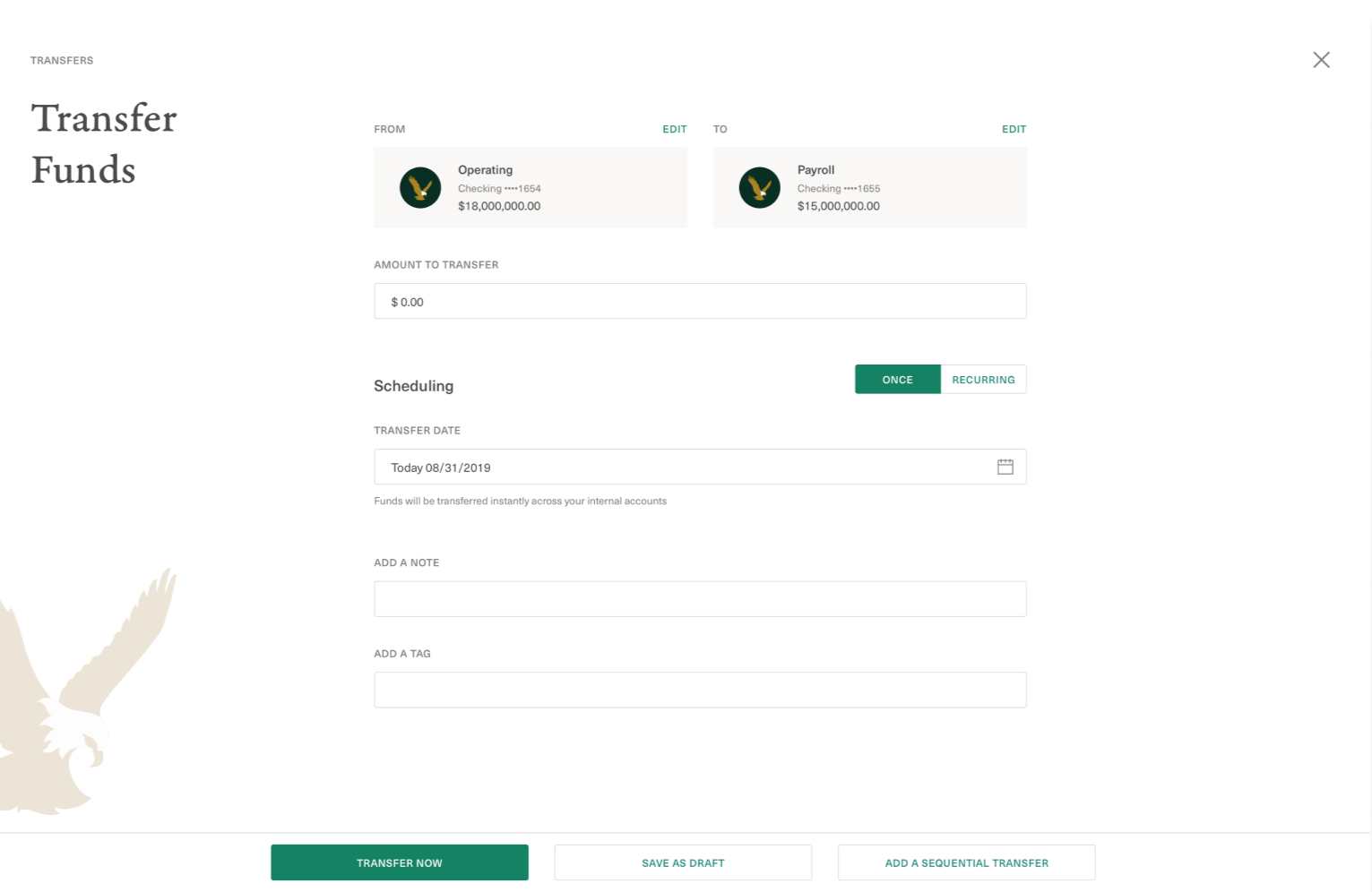
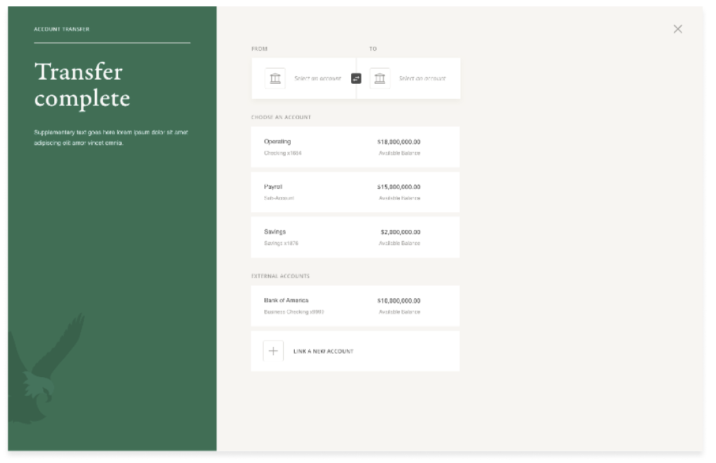
Money Movement
Design intention:
Brand moments & simplification of core flows
Streamlined flows, fields, copy to allow focus & confidence during important choices while moving large amounts of money
Quality of life improvements: save drafts, add sequences, thinking about the workflow
Key Screen
Approvals & status
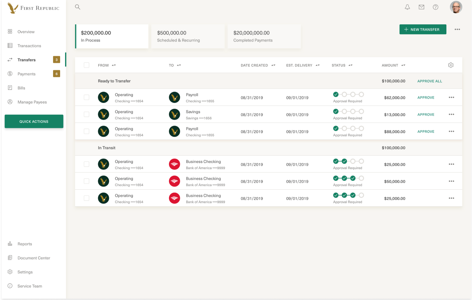
Design intention:
In the details: approval status, money in & out, and status in order to take timely actions
Key Screen
Permissions
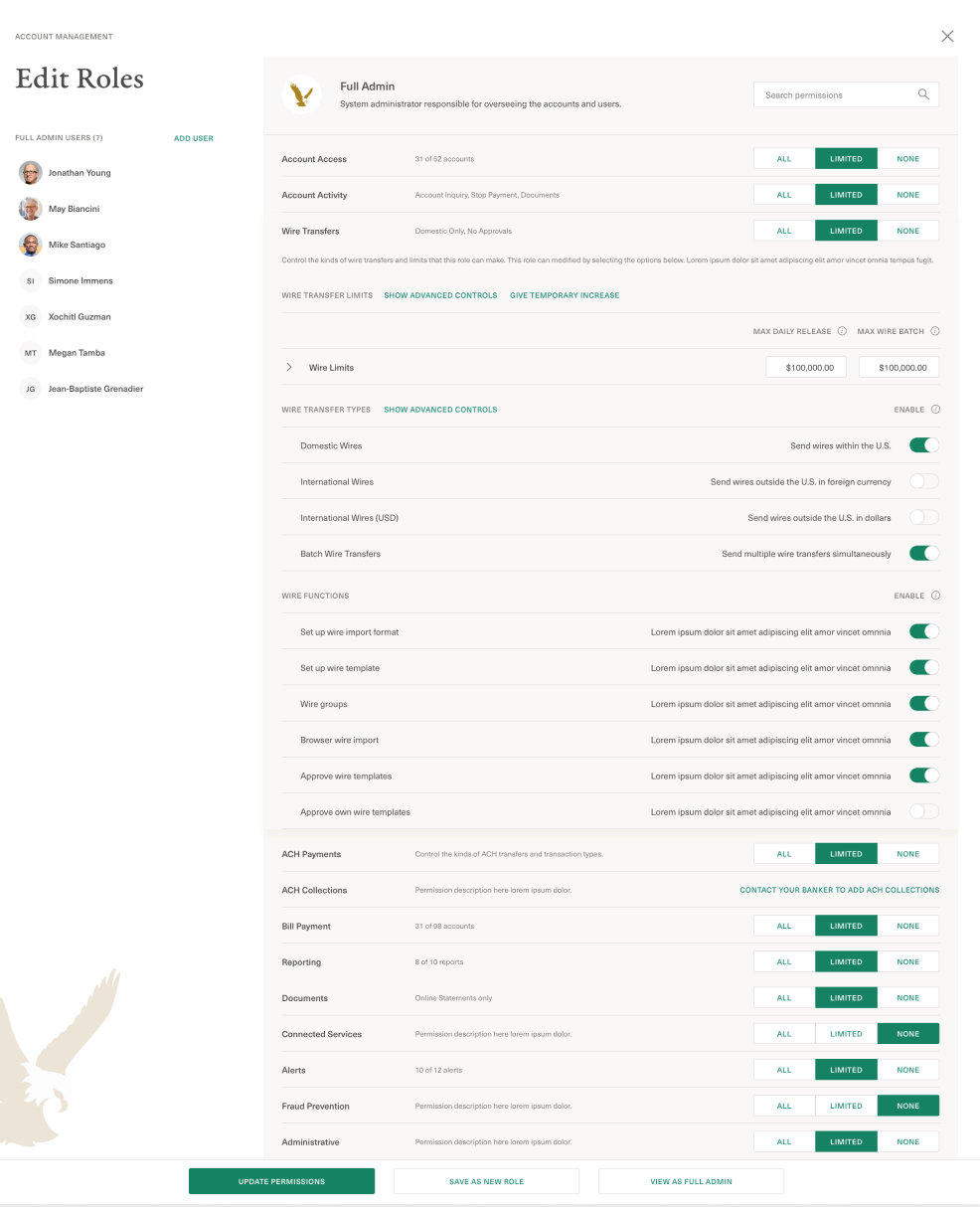
Design intention:
Admin users: keeping safety & compliance easy, knowing who has access to what at any time
Leverage Consumer patterns to enable/disable permissions; make it easy for admin pros and small, lean teams
Outcomes
$45M
transacted
Over $45,000,000 in corporate funds moved through the platform during the pilot month with zero transaction failures or forced support interventions.
Reduced Support Calls
Bankers reported that clients on the new platform were completing permissions, transfers, and document retrieval completely independently.
This gave Bankers back time to focus on relationship management, not completing tasks for their clients behalf.
New Clients & Verticals
Cross sell: Corporate Banking sells Consumer Banking, and visa versa. We saw a related uptick in Consumer Banking conversion from Corporate’s redesign.
New Verticals: Potential clients, in Startups and V.C.s, were shown the new product and converted.