
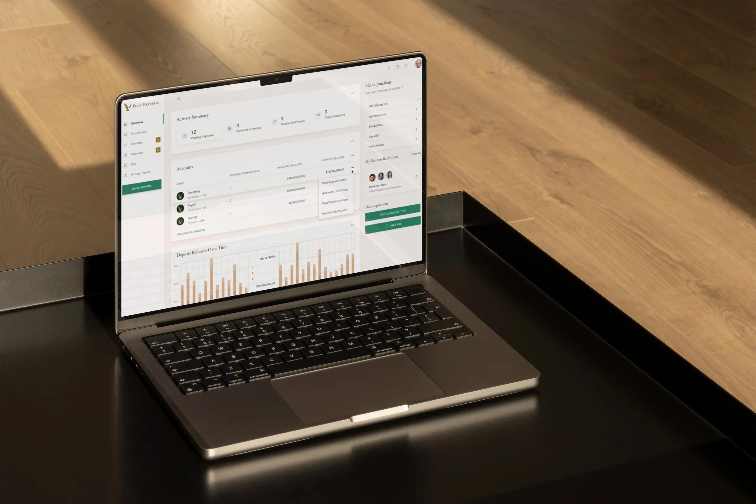
Corporate Banking
Designing in the Millions
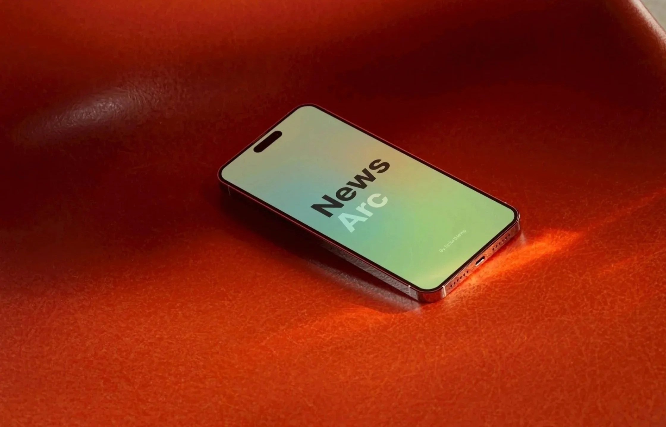
A Unique Banking Platform
Transforming a Billion-Dollar Legacy
My Role: Lead Product Designer
Team & Scope: 1 PM, 1 UX Researcher, 1 Internal Eng Team + 5 External Vendor Eng Teams
Timeline: 12-Week Sprint (Research, Strategy, UX/UI, and Design System Handoff)
Key Business Outcomes:
$45,000,000+ successfully transacted during a 30-day target pilot.
Drastic reduction in direct-line calls to relationship bankers.
100% conversion rate among skeptical Startup & VC target accounts shown the platform preview.
Context
Corporate Banking brought in billions,
almost reluctantly.
Riddled with poor UX and ancient UI, this product had massive potential. The tech it was built on was sunsetting, and leadership thought the only issue was migration.
First Republic Bank built its legendary reputation on high-touch, "white-glove" concierge service. Corporate Banking was anything but: new verticals didn’t trust it, and current users would rather call bankers to complete daily tasks than figure out this complicated product.
I joined the team from Consumer Banking with simple instructions: give Corporate a 'little lipstick' and it will be all better.
What happened?
Leadership and the Product Team initially viewed the project as a superficial visual overhaul.
In reality, the platform suffered from deep UX debt:
1. Feature Rot & Bloat:
Rushed vendor timelines over 15+ years had created side panels full of tools (e.g., Wire Repair, Positive Pay) that 90% of companies never used and never needed.
2. White Glove Or Tech support?
Workflows were so complex and laden with internal banking jargon that clients gave up and called their bankers to perform basic tasks manually.
Bankers were spending all day acting as data-entry reps rather than relationship managers.
3. Growth Blocker for New Verticals
Executive leadership was eager to acquire fast-growing Innovation verticals (Startups & VC firms), but the dated, eye-fatiguing interface was an immediate dealbreaker for modern financial teams.
When these teams gave it a try, it revealed to be as ugly as it was broken.
Just as ugly as it was broken.
The Perfect Opportunity
I made the case to leadership that this backend technical debt migration was our single greatest opportunity to streamline the product, fix broken workflows, and position First Republic to capture modern enterprise accounts.
Design Strategy
Setting Our Three Core Rules
Now that Leadership understood my design direction rooted in user expectations, behavior, and our own tech limits, I worked with them directly to weave our core product strategy straight into the visual interface through three strict design rules:
Trust Through Attribution: Every screen prioritizes verified publisher branding over AI-generated elements.
Transparent Curation: Intentional UI touchpoints show the exact logic behind why an article was recommended.
Fluid Layout Pacing: The interface balances heavy, hard news with high-engagement lifestyle content through seamless interaction design.
[Design Detail]
News in Motion
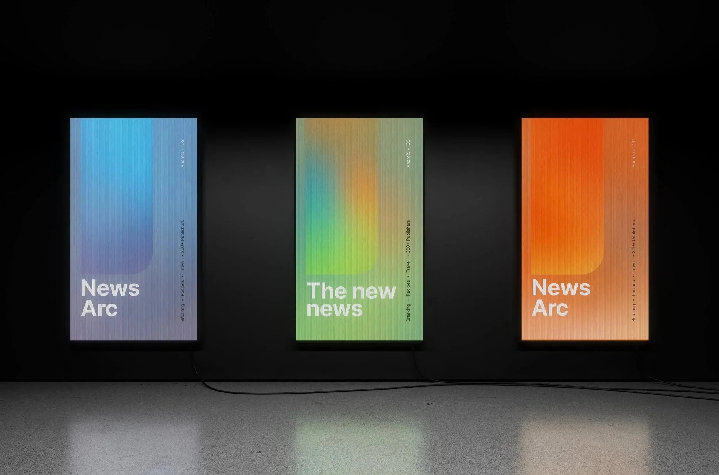
Tasked with balancing product and brand design without a marketing team, I explored how color and motion could visually represent the shifting "mood" of news clusters generated by an LLM.
Although leadership requested bright maximalism, I kept the application subtle to avoid distracting readers.
While the initial feature wasn't adopted, the refined concept of color hues and movement evolved into a personalized visual beacon that guides user attention and shapes our broader brand identity.
Exploration:
Mini Arc
Exploration:
News Map
Applied:
Curated moments made for you
Results
Going from Zero to App Store in 90 Days
My design direction, leaning into trust, transparency, and personalization became the MVP. This proved to be a major turning point for the company, capturing strong behavioral signals within our target US demographic and meeting all core success metrics, including time spent per article, subscriptions & registrations, daily visits, etc.
Scaling Success to the Global Flagship
Rather than competing with this new app, the company had confidence in adopting Newsarc into the global SmartNews product.
I worked with the larger team to bring the ideas, patterns, and features to the SmartNews product, being meticulous to create these successful pieces the right way to not disrupt the existing user experience.
This was a definitive turning point for the company's product culture. By using design to separate pure tech hype from genuine user utility, I gave an established Japanese company the confidence to safely abandon legacy experiences that failed to resonate in the US.
It proved that creating something successful from nothing doesn't demand massive timelines or runaway budgets—just sharp product instinct, technical realism, and an open-minded team.
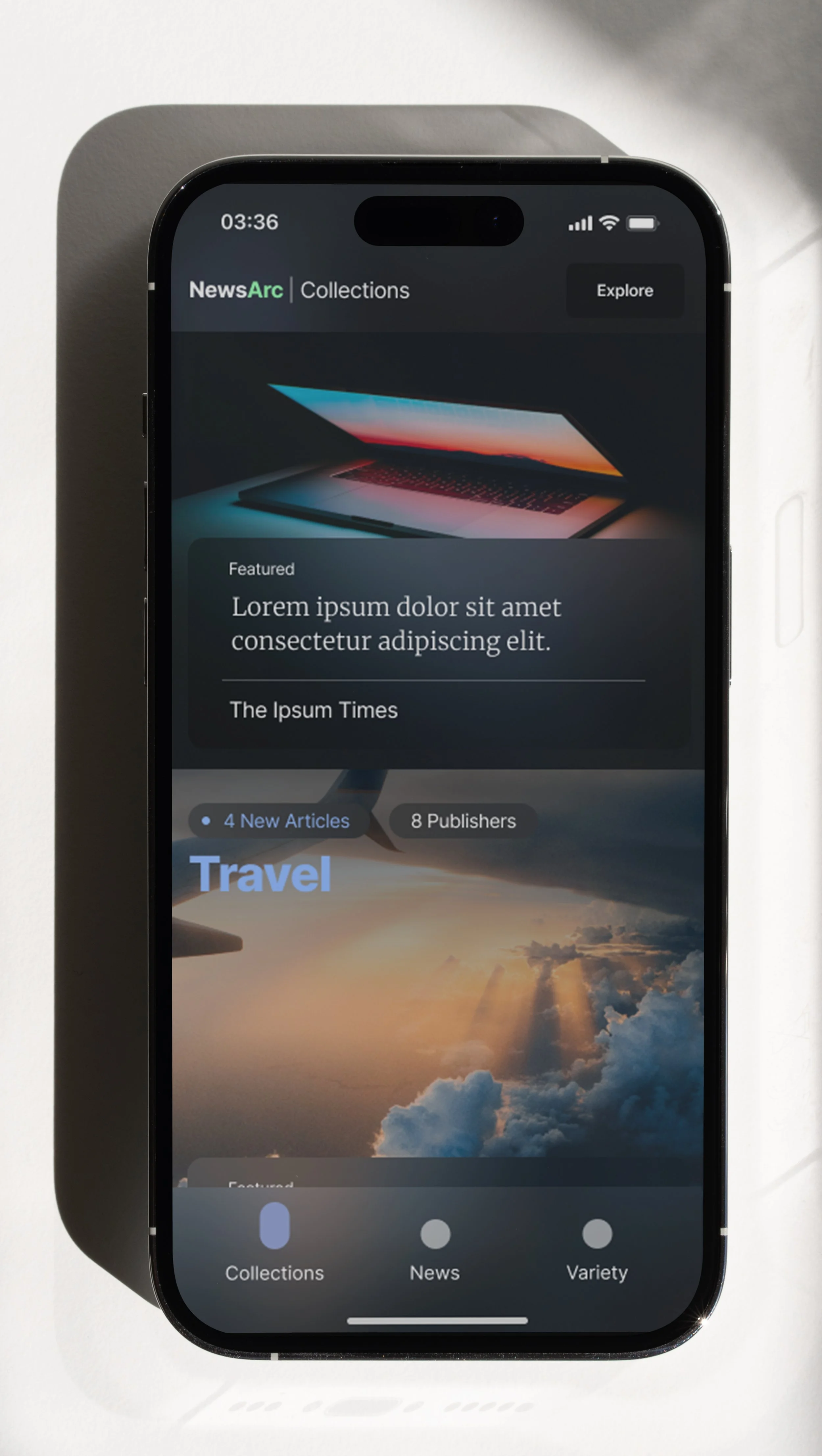
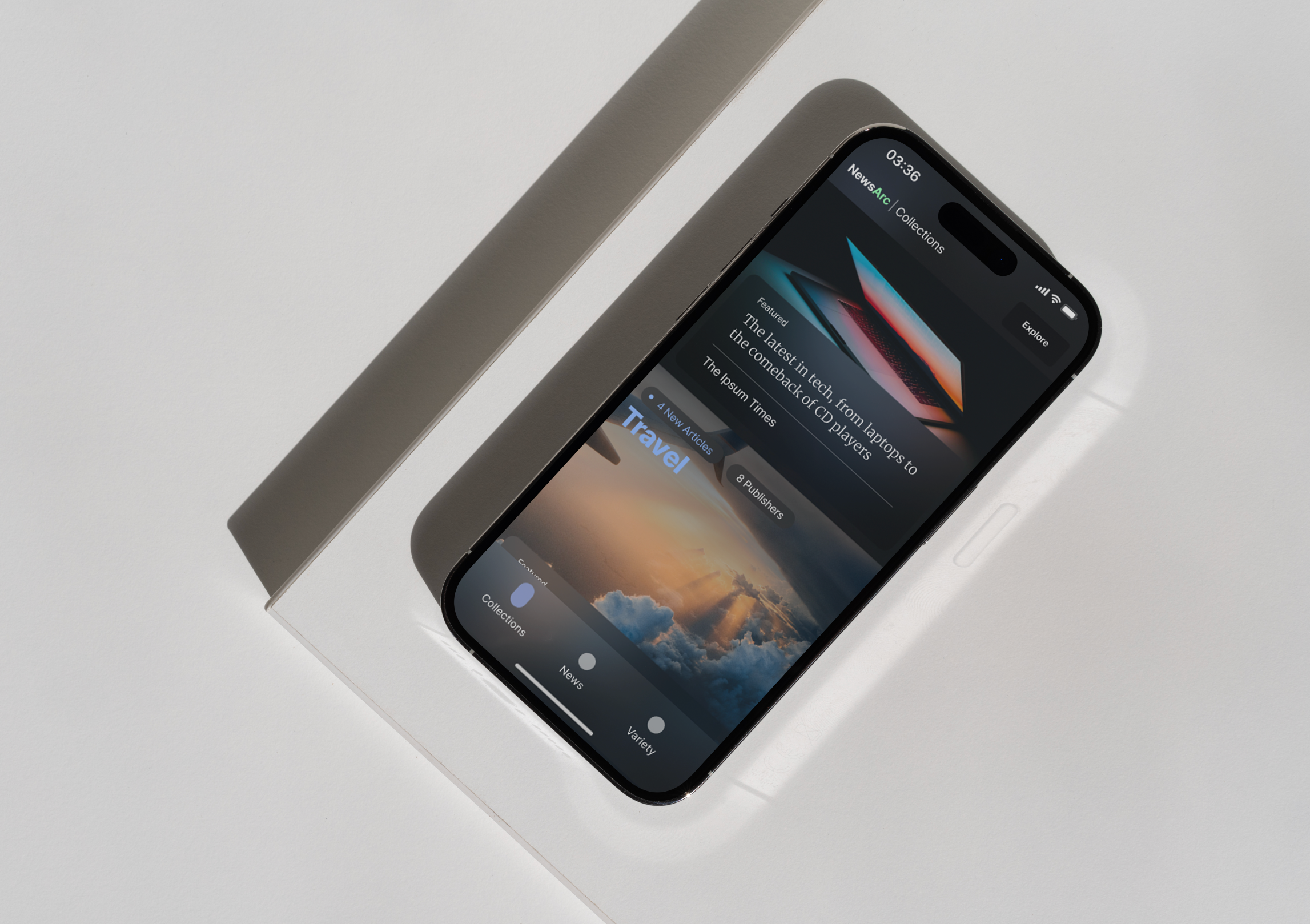
Key Mock: Collections
User created playlist of topics
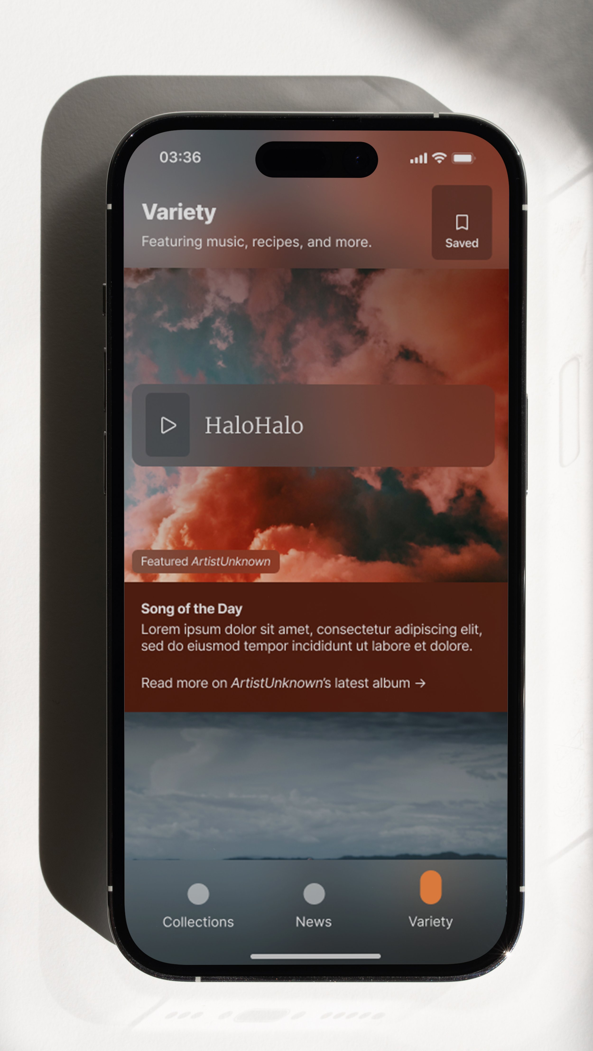
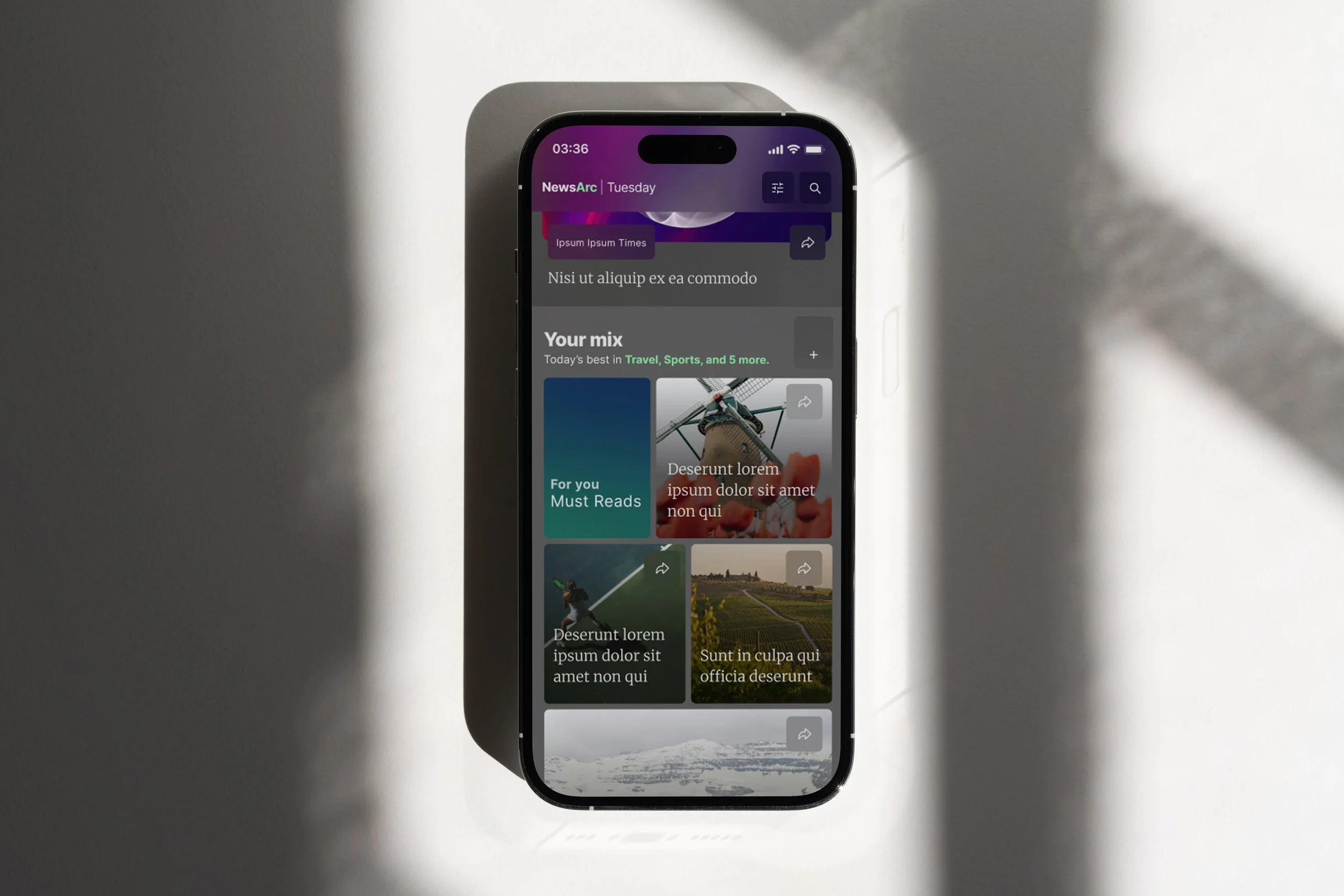
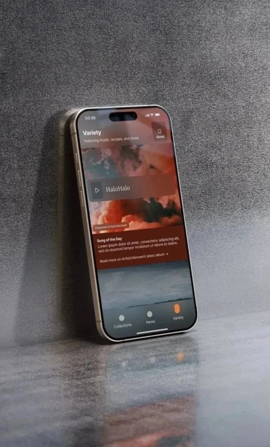
Key Mock: Variety
AI recommend list of soft news
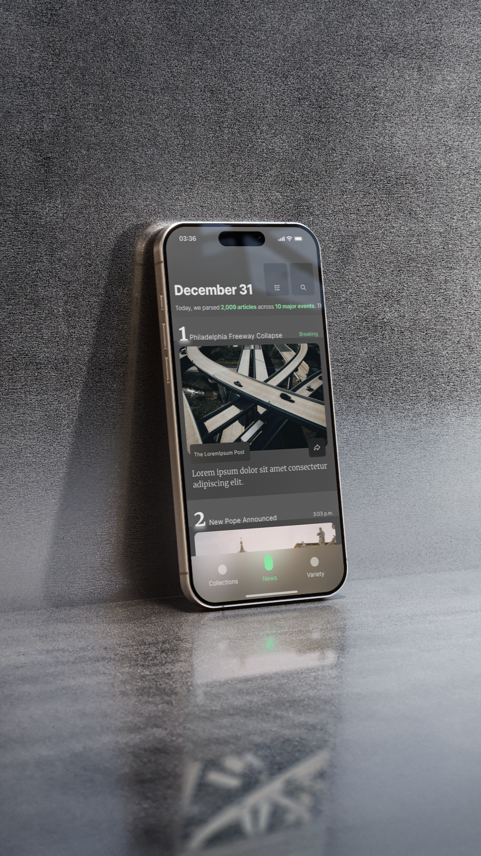
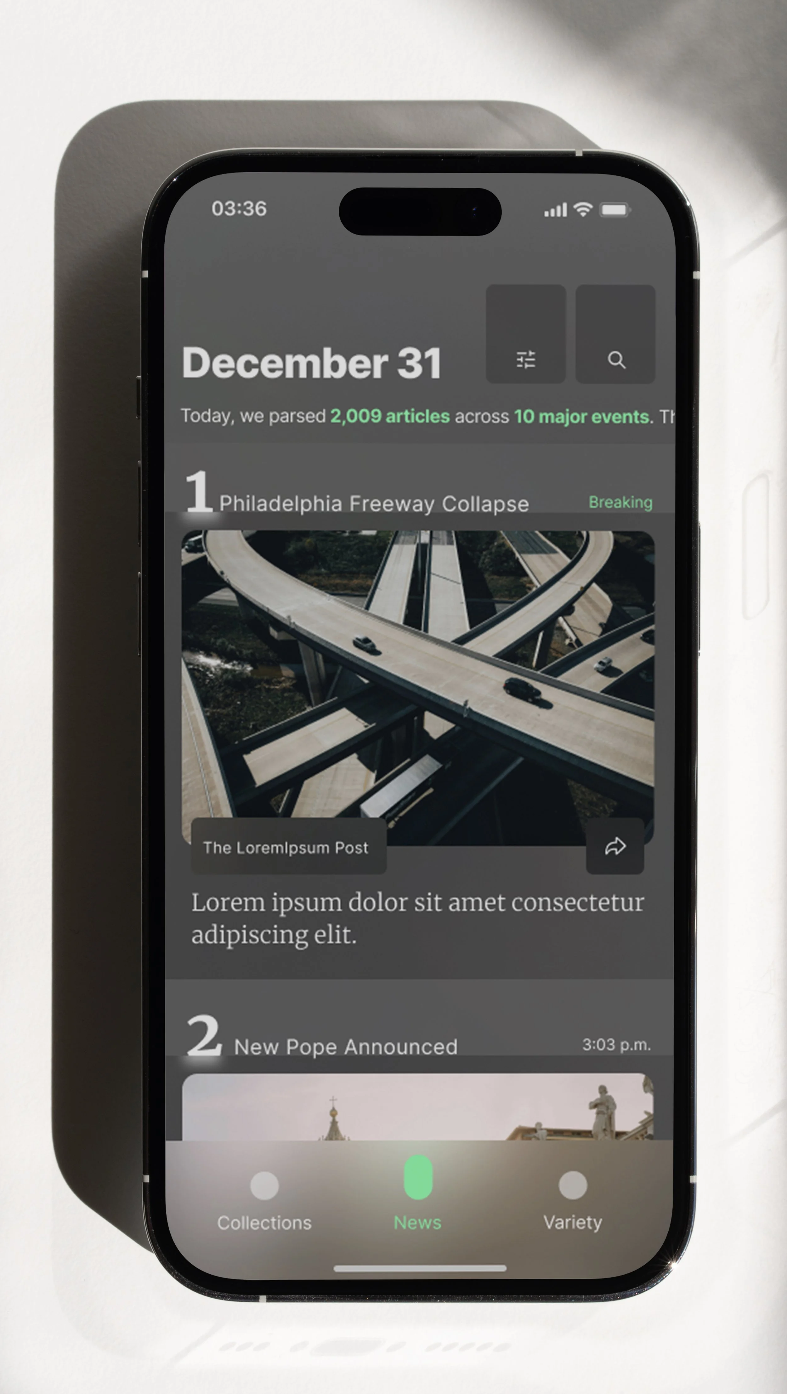
Key Mock: News
AI ranked & curated hard news