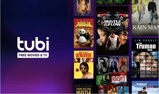
Ad Based video on demand
Tubi
My Role
Designing Growth success
Empowering The team with design thinking
Not beautiful, not perfect, but the right process needs to start somewhere.
This was the first step of many to get Tubi on track for Growth Methodologies, and away from analysis paralysis.
The Challenges
The Breakdown
When I joined, the V.P. of Design had just left and the team was two Junior Designers.
I was brought on to connect dots: across pods, experiences, features, and all devices. Some of my achievements were:
Implemented the first multi-variable test at Tubi
Designed Tubi’s first large scale event: FIFA World Cup, live & free
Scaled design team: hiring, process, & culture
Focused on growth, conversion, retention for new and returning users
Thinking end-to-end: from mobile devices, to tablets, to watching on the T.V. in a hotel room
Tubi defined success as users watching at a total of 5 minutes during a session.
Stemming from younger days of Tubi, this metric became a standard since it meant users saw a reasonable amount of ads.
While this was great for ad revenue, this metric wasn’t reflective of successful user behavior.
Poor Metrics
Risk Adverse
Wanting to grow, Tubi hired many PMs.
Unsure where to start, the Product Team would turn to incremental testing against the 5 minute metric.
With a lot of cooks in the kitchen, many product initiatives were repetitive, coinciding in testing, and were parities rather than problem solving.
Core Team: 1x Designer (Me), 1x PM, 1X Tech Lead
Goal: Achieve 5 minutes of Total View Time (TVT) from New Users
→ (Late Add) No drop in registration
Timeline: 8 Weeks, including build time
My Design Perspective
As the Lead Product Designer across three pods that all played a part in this effort, I needed to find out more about what’s currently happening with our new users.
I needed to understand their behaviors, motivations, and disappointments.
From the provided goal, I knew that something was causing new users to watch under 5 minutes of content, but the ultimate goal of New User Retention could be bigger than this metric.
I started with these key questions:
Why do New Users watch 5 minutes or less?
Why is 5 minutes the measure?
When do New Users bounce?
What motivates New Users to stay?
What was happening?
From existing data on First Time-In users, I created a Journey Map of the current experience.
The data was from a specific TV platform’s sample base of 100,000 new users.

Current flow: pain points
The current flow for all New Users started with opening the app, seeing a Registration Page, then eventually arriving to Tubi’s Movies & TV (Homegrid).
Users were most likely to leave at the initial Registration Page (15% dropoff), or after arriving to the Homegrid (75% dropoff).

Diagnosing the issue
I needed to recruit the help of UX Research and a handful of other teams to begin shaping what successfully retaining new users could be in a design.
Knowing that we’re losing new users within moments of app open clued me in to this critical moment.
From my earlier questions, I had a direction as to when users bounce, and some insight into why less than 5 minutes, but I wanted to learn what could make them watch, see Tubi’s value, and come back to us again and again.

The diary study
My PM and I turned to UX Research for help. After discussing, our UX Researcher recommended a week-long Diary Study to get more insight on what new users are experiencing, their motivations, and their desires for consuming content.
Key takeaways
Barrier 1: Users thought the Registration Page meant that Tubi was a free trial, and were unsure what they would receive from registration. They don’t want to pay for another thing, and have paid services they trust and use.
Barrier 2: Users were frustrated with the Registration Flow and subsequent screens, and felt it prevented them from browsing/seeing what Tubi is.
Insight: When on the Homegrid, users said they saw “irrelevant” and “older content”. Users expressed interest in new and recent titles, specific actors or directors, and interests (ex: horror movies, sports, etc.)
Research

freemium and older content
The Diary Study pointed out copy confusion and brand understanding in early first-impression moments, as well as a grid of “old, outdated” content.
Outdated content and brand confusion were identified as issues, and exploring these ares could be influential for New User Retention.
I wanted to know more about how Tubi talks about itself in-app and out. I met with Brand, Marketing, and Studio teams to understand more about the billboards, campaigns, and other work they carefully curate to promote to the masses.
I learned about the tone and voice, trending and evergreen content, and titles that created excitement and bumps in new users.


Finding Inspiration
Gathering impactful language and artwork direction was one thing, but what was happening in our streaming space? My PM and I looked at similar companies as well as other products that introduce their brand, offerings, and differentiators.
As a designer, I also like to bring in inspiration from “unrelated” products. Thinking about Tubi’s values, I saw inspiration in Spotify, Calm, Walmart, etc.

Balancing Standards & User Needs
Considering all we’ve known and uncovered about our opportunities, how do we move forward?
We can’t retain users that:
Think the first screen is a paywall and leave
Reach the Homegrid and are overwhelmed by outdated, non-relatable content
Watch something, but eventually return to the value of paid services that ensure their favorite content is readily available
Keeping in mind limitations to Guest Accounts’ inherent lack of personalization, and unable to change the Homegrid due to scope, I wanted to explore designs that removed the barriers, allowed users insight into who we are and what we offer, and get straight into watching.
This design direction was unique in TV apps, but not to other products educating users.
Our competitors didn’t have this challenge due to forced registration and subscription models, and built-in limited content (ex: Fubu).
Stage 1: Explorations
Narrowing in on initial app open, our highest drop-off area, product and eng agreed to focus on a lightweight education solution to test before moving forward.
While designing, I thought about:
What should a new user know about Tubi? What impression do we want to give?
What, if anything, do we want a new user to do?
What are we expecting to happen and how will we measure that?
I sketched out ideas which became prototypes.
These initial sessions were to brainstorm with our partners, discuss, and gain confidence in our direction.
As this was not only a new initiative to retain New Users, this would also be an update to our design system across all platforms.

With everything I knew so far, I formulated the following ideas to guide the design process:
A user should be allowed to explore Tubi and discover education throughout the experience.
With contextual information and intentional slow-downs, users can passively learn while they browse or watch.
An informed user will be more likely to return, increasing retention.

I wanted to explore different education formats (in-line, action-based, takeovers, email campagins) throughout the TV experience and beyond.
While I worked primarily with one engineering team (which covered most TV and Native Mobile Apps), I’d need to design something that could scale or adapt to other devices and form factors.
Once the pod had reached an agreement on direction and approach, I created prototypes and mockups for another round of testing.
I wanted to test:
Effectiveness without Refactoring: This design reused an under-utilized, lightweight component that existed across all TV platforms.
Impact of Copy: The design had to make the right impression and get users familiar with our content. I refined copy that had successful results from marketing campaigns to general audiences. I created designs that explored Why Tubi and reflected interests from users in the Diary Study to get copy-specific results.
Visual Insight: As an existing component, I optimized for readability, varying character length and languages, and visual interest/disruption. Considering changing availability of titles and to break up the monotony of poster art, I explored iconography and emojis alongside copy. I wanted to test visuals could scale based on the tech and (potential) future usage.
UX Insights: From earlier research, the Registration Flow became a barrier, and the Diary Study pointed to Live TV as a retention motivator for users seeking a cable alternative.
I removed Registration, added Live TV to a prominent area, and allowed users to follow a path that opened the options to all our content: Movies & Shows and Live TV.
Stage 1: Result
The UX Researcher ran an unmoderated study with 1000 participants to gauge general reception and to discover trends based on users’ actions.
Highlights were:
90% of Participants expressed learning something new about Tubi’s content and offerings based on the education they saw.
A large majority of those participants, users were more interested in Tubi’s collection and began exploring rather than bouncing.
Users interested in the Live TV offering said they were seeking local news, sporting, etc. and that Tubi would allow them to leave cable.
About 50% of participants said that they were delighted to learn about specific genres/offerings, like Anime and Italian Cinema, and would leave other services, like Crunchy Roll and Hulu, if they could watch certain titles for free on Tubi instead.
Outcomes
User feedback informed our pod that showing users the two sides of Tubi gave them a more direct path to relevant content.
After interacting with education directing them to select a side to explore, users were more oriented to Tubi’s offerings and content.
Overall, this design effectively educated users on Tubi. Without being obtrusive, users were informed and able to explore -- creating interest rather than bouncing, which made users more likely to remain to watch 5 minutes.
But...
Due to decisions above us, we were informed that we must include a Registration path in this educational content. While this was a late requirement add, it was another design opportunity to explore.
Knowing that Registration had been a pain point in a New User’s Journey, and that many users wanted to explore content with the intention to watch something, I had to balance this ask with a thoughtful design approach.

change in plans: reworking to deliver on -time
Designs from Stage 1 showed us that user interest lifted through education about Tubi. Now I needed to design a way for users to feel invited to register and make sure they don’t feel forced, trapped, or confused.
I had to balance this new requirement by explaining why we needed another design iteration, and why simply bringing back our existing Registration Page into the flow was not recommended.
Registration needed to share the spotlight, but not be front and center.
Design Hypothesis v.2
An informed user may be motivated to register once learning about Tubi’s vast collection.
Users that feel confident and clear in what they gain from registering are more likely to complete the registration process.
Uninterested users should be allowed to continue on their exploration but have a clear path to register.
Exploring Registration
With engineering, I looked at a few options to incorporate registration in a meaningful way.
Accounting for feasibility and reuse of existing components, many options like cards, carousels, and toasts would increase scope.
To meet our deadline and keep interruptions for users as minimal as possible to prevent dropoff, I experimented with a Registration CTA placement in my Stage 1 design.
Rapid Testing
We had a hard deadline and the pod felt confident in modifying what we had.
Adding a Registration path in the secondary position avoided bringing back pain points and mitigated adding more steps.
Leadership allowed us to launch to a specific group of devices and this test needed to maintain a 13% registration rate or higher in order to launch to general availability.
Actual Results

Phase 1 Final Design

This test ran for two weeks, and the results were:
Registration was at 14% on test groups
The rate at which New Users watched content averaged higher.
There was a 2% total lift in viewers watching past the goal metric (5 mins TVT). Projected to 640,000 New Users across all of Tubi.
This was considered a win by the business and was greenlit to all TV platforms.
Our goal was to increase retention for new users, and was measured through Total View Time (TVT). This design achieved the TVT goal for New Users.
Registration remained almost flat, but we saw an increase in TVT. This opened the conversation to consider the experience overall and beyond the TVT metric.
What happened next?
During testing, my pod started looking at other ways to boost this impact while it was trending positively for TVT. I designed more gradual disclosure education panels based on user behaviors/watch times with specific content, release windows, and genres.
I also partnered with other PMs outside of my pods that were interested in educating existing users.
Despite the results, an ongoing rebranding effort and technical cleanup paused rollout to all platforms.
The Marketing Team felt more comfortable pausing rollout until the rebranding was consistent across all devices.
What I’d Do Differently
Exploring options to enhance the Homegrid experience.
Due to existing limitations, I’d like for Product and Engineering to rethink the system. Design was overly constrained by existing components from this lack of upkeep on TV systems.
Would like to have explored other New User entry points for a broader education approach. While many users watch Tubi on their TVs, many users first discover Tubi from web searches and social media.