
Newsarc by Smartnews
0 - 1 MVP
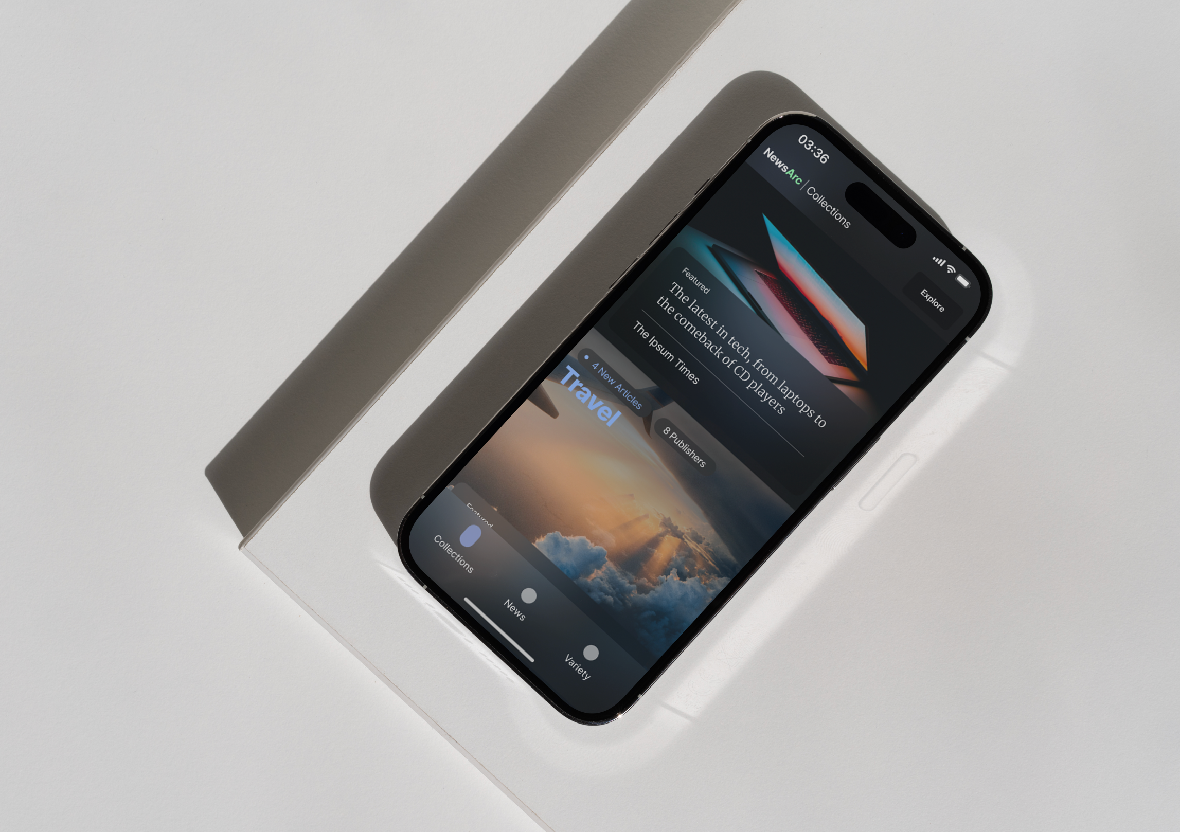
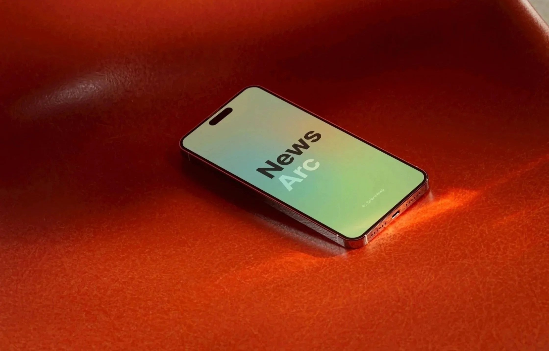
Designing NewsArc
An AI News App for the US Market
The Challenge: The U.S. Market
SmartNews is huge in Japan, maintaining a monthly active user count of over 20 million readers. However, the platform struggled to win over American readers.
As the only designer on the team, I worked directly with the SVP of Product and the CTO to design a generative AI app made specifically for how Americans read and participate with the news. Rather than dealing with 10 years of old code, this was a brand-new app from scratch.
The Reality: New Leadership
To successfully scale a global product for the US market, I was the bridge between abstract leadership visions and a distributed team across the U.S. and Japan.
When leadership proposed high-level concepts that did not align with US market expectations, I refined their concepts through competitive analysis and research, to transform what wasn’t resonating into data-backed designs.
Product: NewsArc, now part of the main SmartNews app
Role: Head of Design (sole product and brand designer)
Timeline: 3 Months (idea to App Store)
Team: SVP of Product, CTO, ML & Engineering Squads, myself
Outcome: Exceeded success metrics (returning daily visits, time spent per article, subscription, etc.), became standard for global flagship, adopted & integrated
Where concepts meet craft
Shown are a few explorations I made to pin down the shape and scope of Leadership’s vision.
I brought inspiration from audio platforms, streaming, social media, gaming, and fashion magazines to leave no approach unturned.
As a designer, I want to make sure what we create together harmonizes with the tech, business goals, and intended audience while balancing feasibility with imagination.
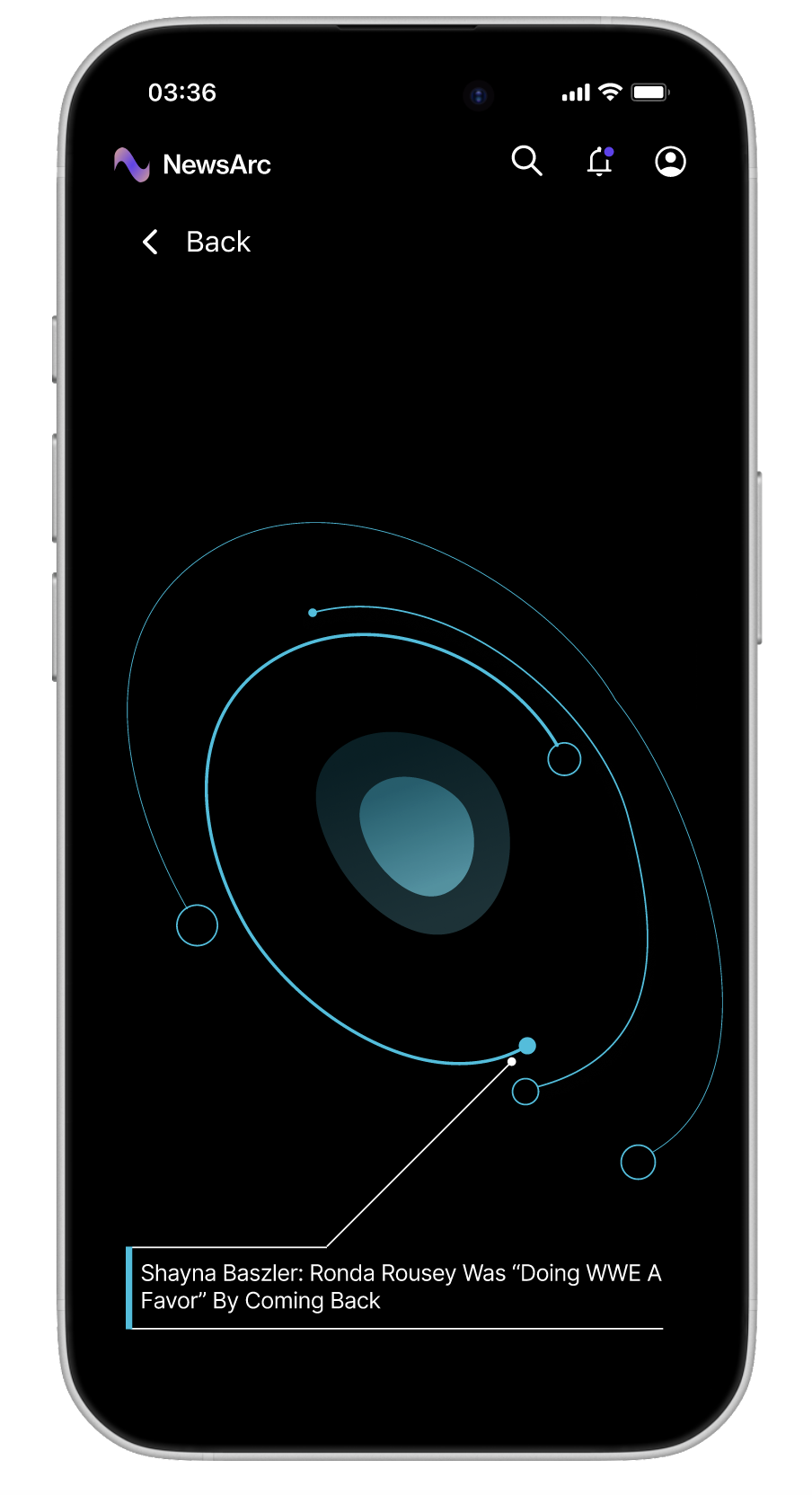
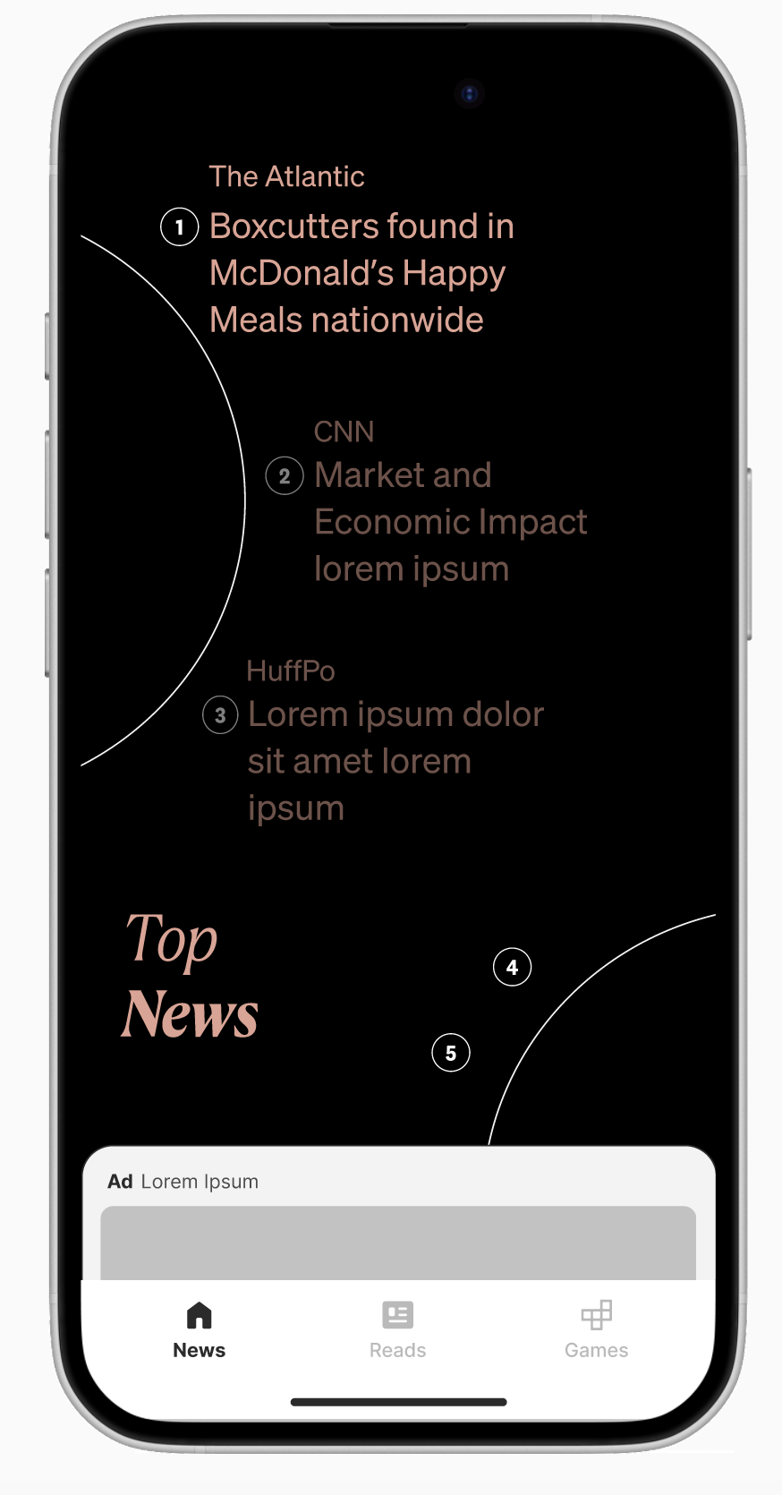
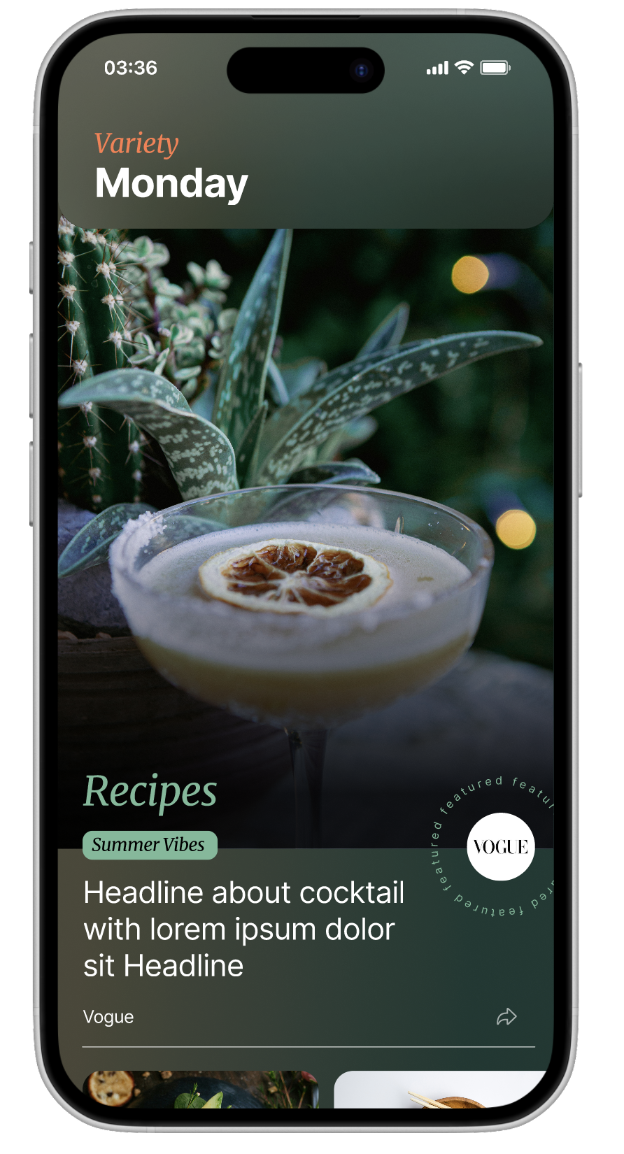
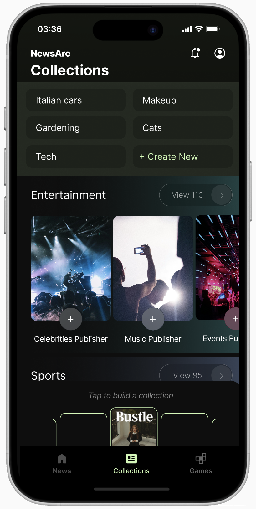
Explorations on synthetic news, LLM clusters, and more
Design For Trust, not For Trends
Leadership proposed various unproven AI features that risked user trust in the US news market.
To maintain product focus and quality, I carefully evaluated these ideas and recommended which to drop.
Here’s why:
News Map (dropped)
Leadership envisioned a visual map experience powered by the LLM and wanted it to look Sci-fi.
I dropped this concept after testing proved it violated core user mental models. Readers want to know what’s happening now, not pan and zoom around a video game style interface to discover what is happening in the world.
GENAI SUmmaries (dropped)
Leadership wanted the AI to write news summaries. I monitored other companies attempting this and saw they were consistently failing due to hallucinations and misjudging the tone of serious, sensitive reporting.
More importantly, it ran completely counter to user sentiment around news trust, so I recommended shelving it to protect our brand's reputation.
AI CHat forums (dropped)
Leadership believed the news would be more engaging with AI-run discussion boards. I recognized this as an outdated community model that testing showed quickly became toxic and argumentative, so I recommended to cut the feature.
Craft A Path, not just pixels
Design means collaborating, but also means crafting a path forward.
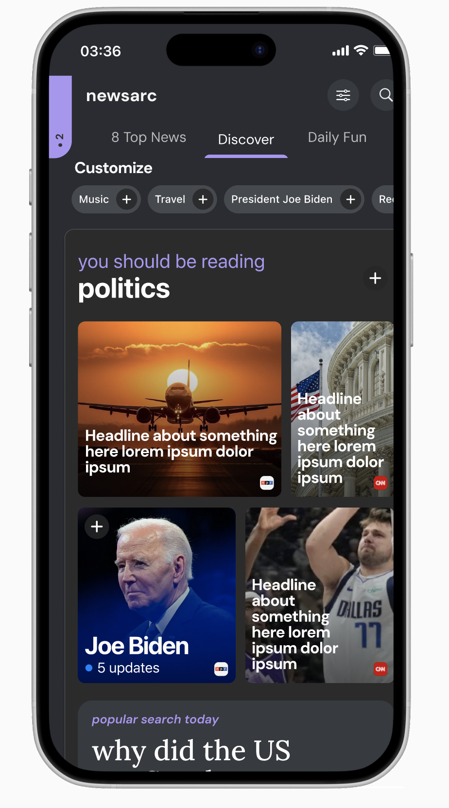
While exploring Leadership’s vision, I crafted a design-first variation based on their vision. I did this by informing my designs with pre-existing research on what could attract American news readers:
Real Content, always: showcase our publisher partners; real journalism, real brands
AI powered: Takes on the heavy lifting of the ever changing news landscape to recommend all kinds of reading
Made for you: From breaking news to your favorite team, personalize your experience
Through continuous exploration, validation, and experience creating scalable products, I focused on crafting experiences for balancing the news (hard and soft) and topics of interest (personalization).
I pitched my concepts to Leadership, showing that my designs were based on their goals, the tech we built, and research of American news readers.
They loved it.
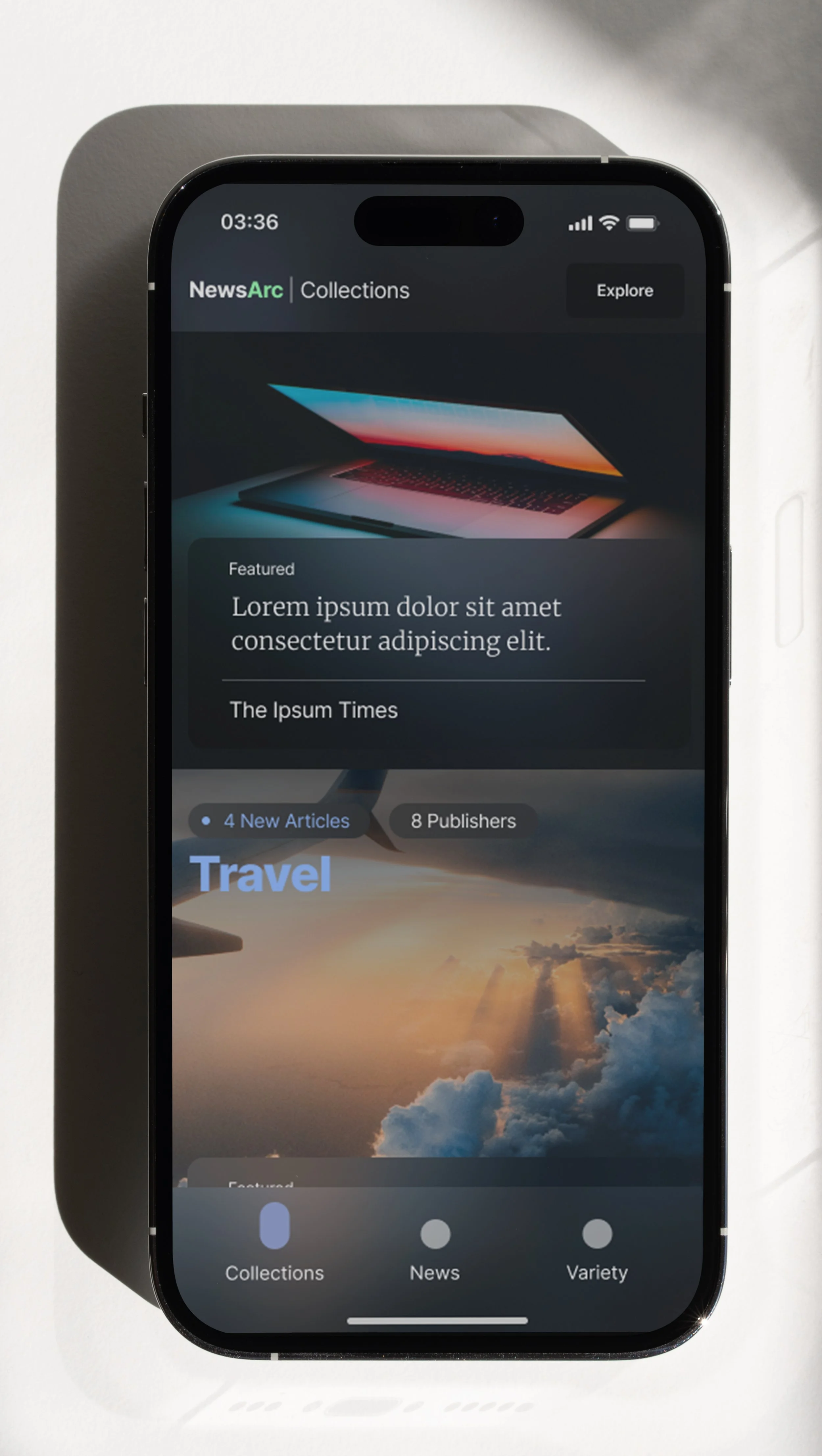
Key Mock: Collections
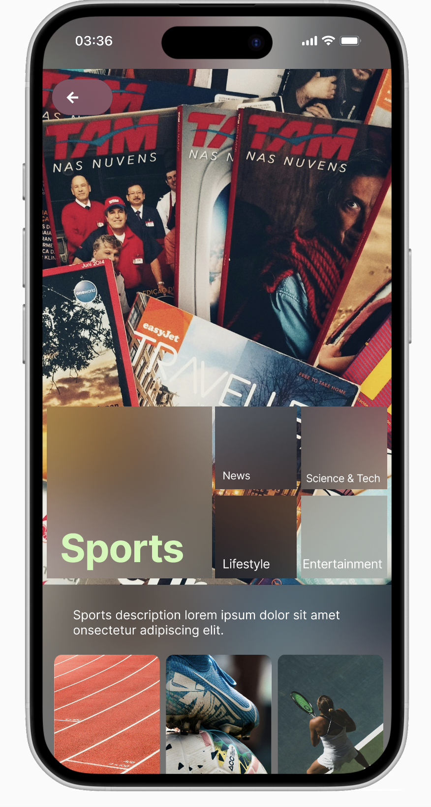
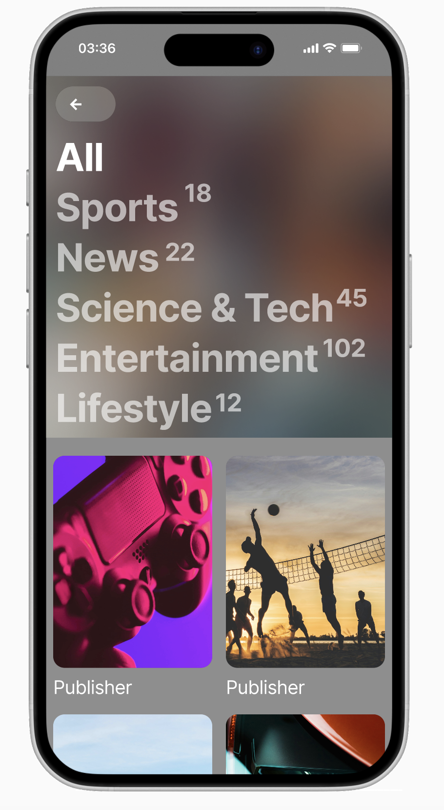
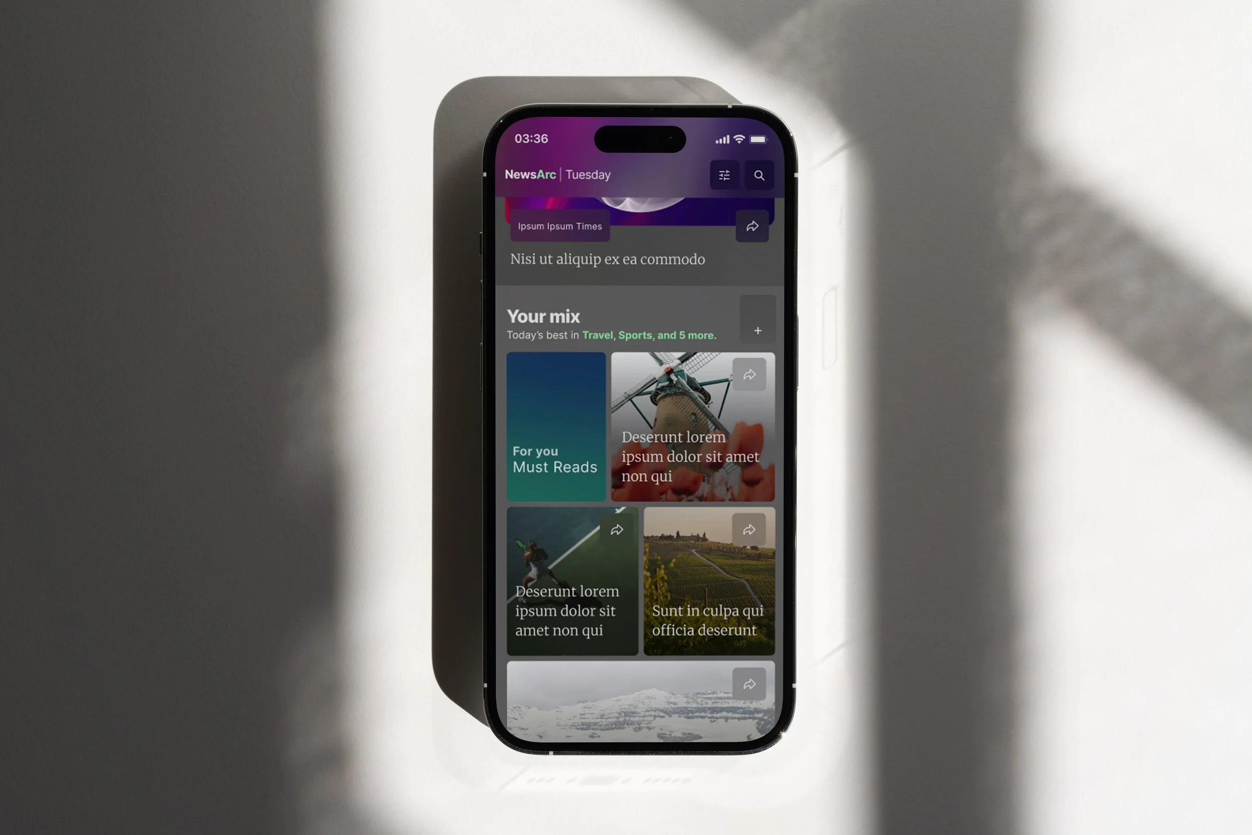
User created playlist of topics
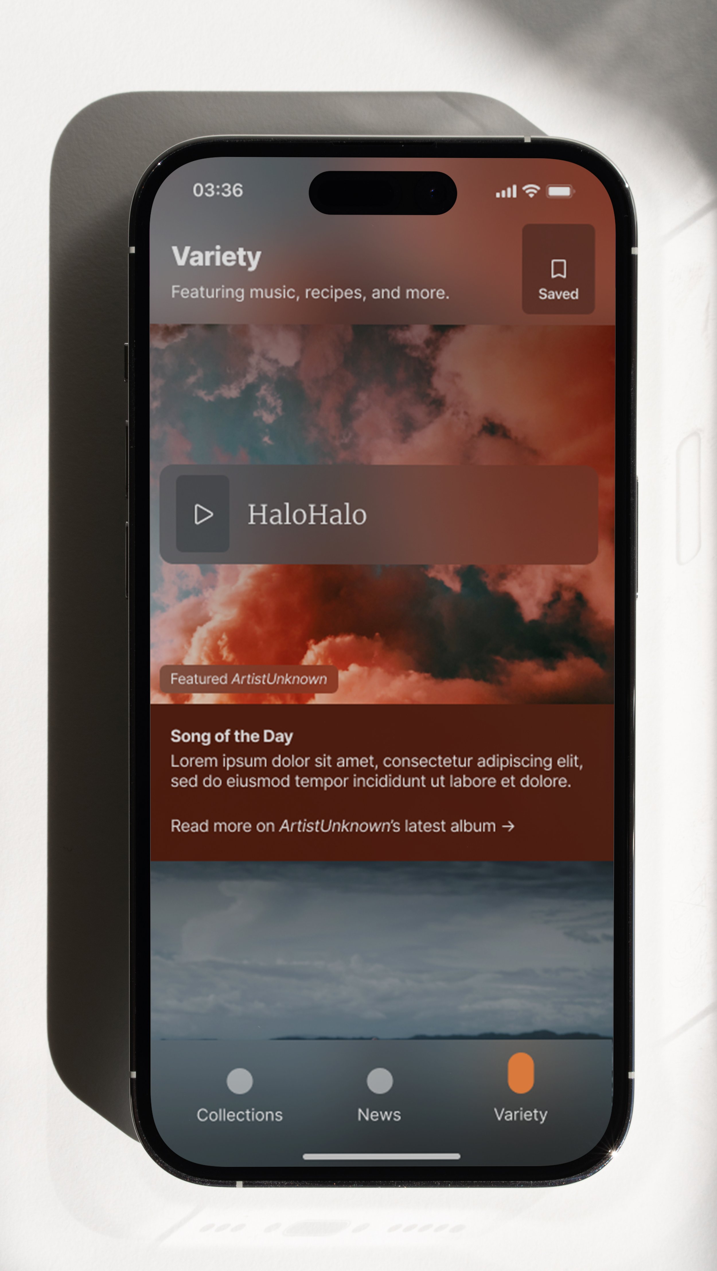
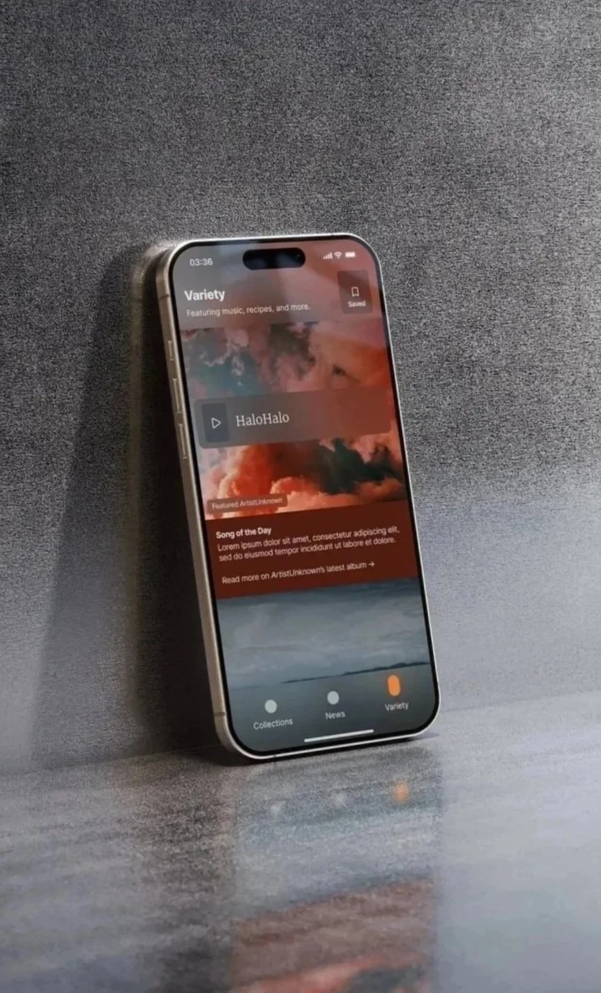
Key Mock: Variety
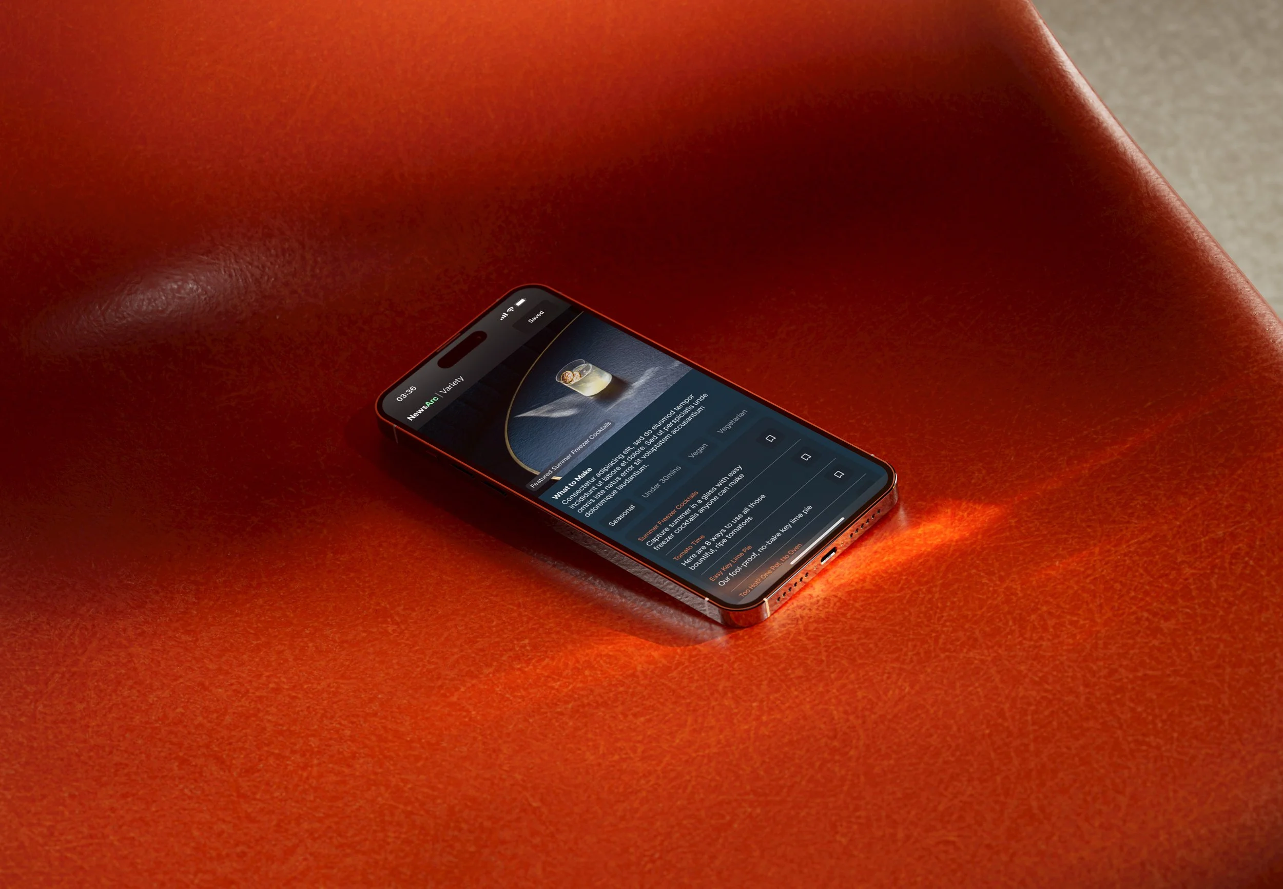
AI recommend list of soft news
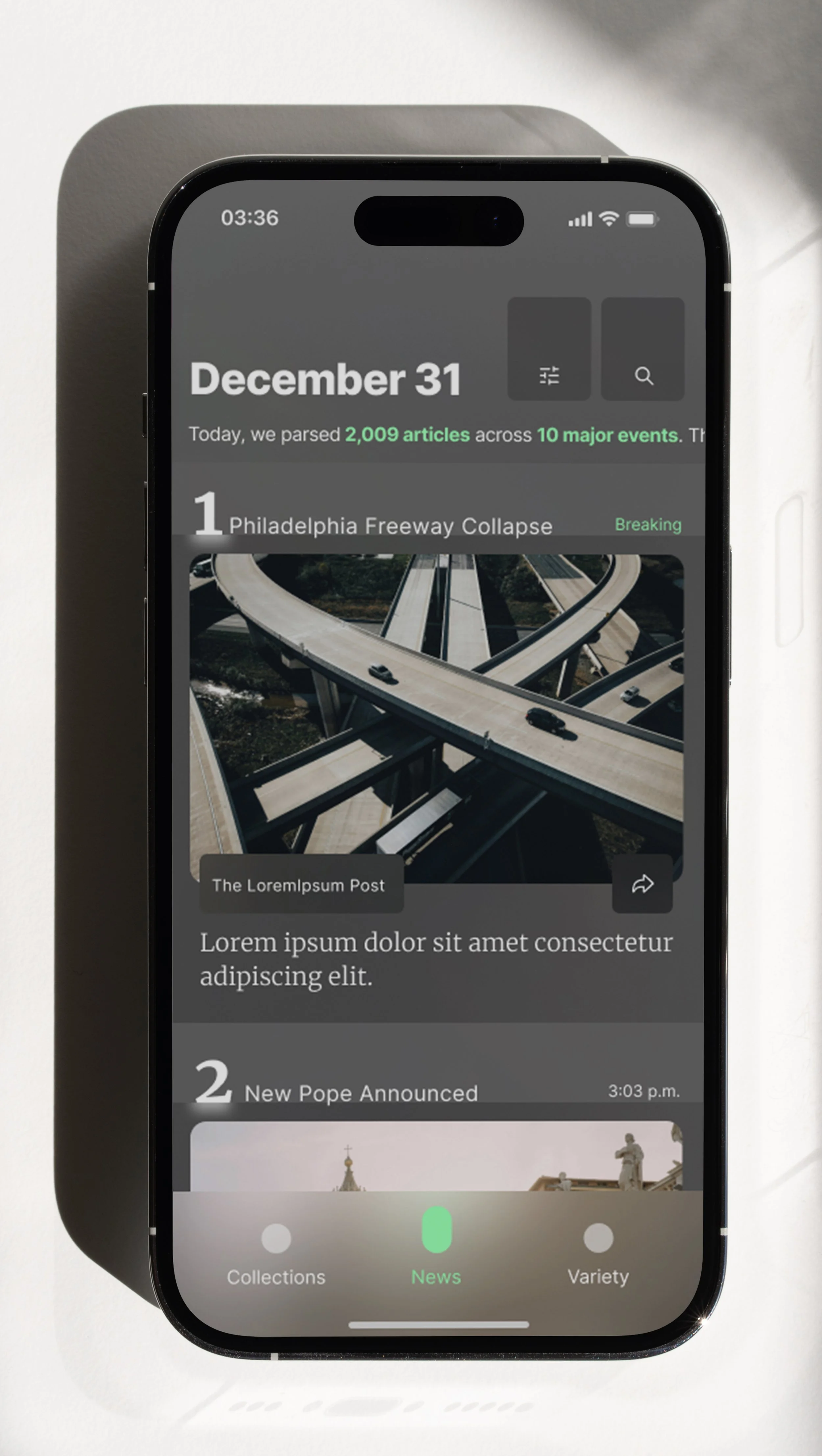
Key Mock: News
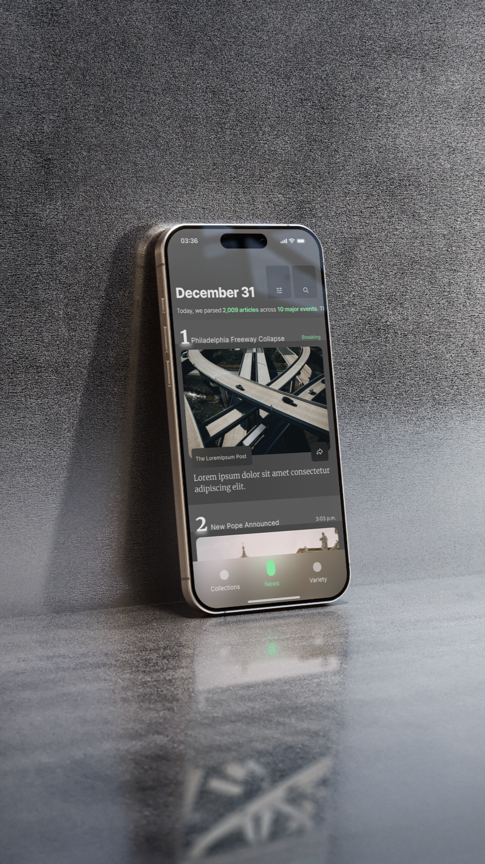
AI ranked & curated hard news
Design Strategy
Setting Our Three Core Rules
With Leadership supporting the vision I brought as the direction for the MVP, I worked with them directly to weave our core product strategy straight into the visual interface through three strict design rules:
Trust Through Attribution: Every screen prioritizes verified publisher branding over AI-generated elements.
Transparent Curation: Intentional UI touchpoints show the exact logic behind why an article was recommended.
Fluid Layout Pacing: The interface balances heavy, hard news with high-engagement lifestyle content through seamless interaction design.
[Design Detail]
News in Motion
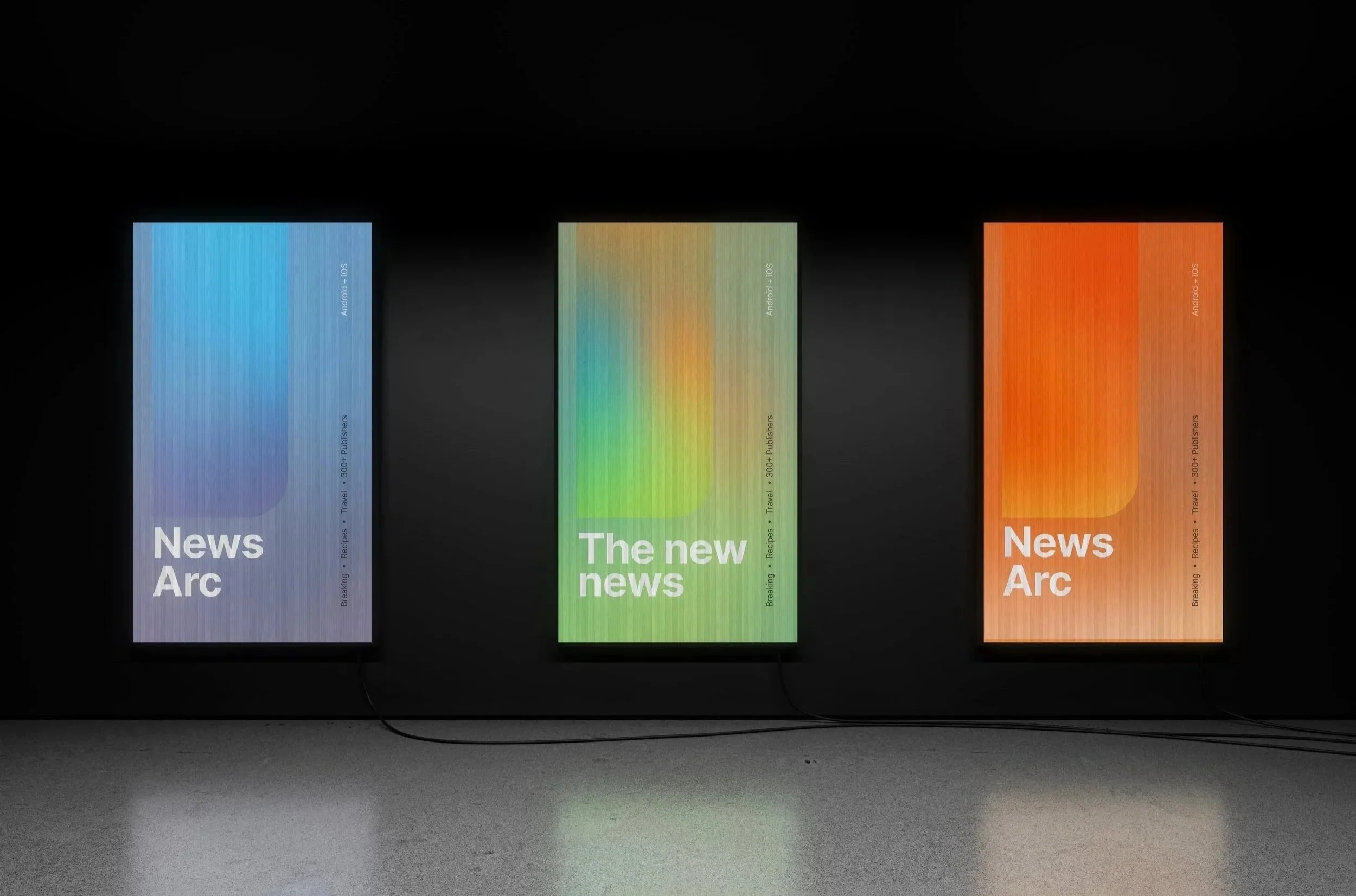
Tasked with balancing product and brand design without a marketing team, I explored how color and motion could visually represent the shifting "mood" of news clusters generated by an LLM.
Although leadership requested bright maximalism, I kept the application subtle to avoid distracting readers.
While the initial feature wasn't adopted, the refined concept of color hues and movement evolved into a personalized visual beacon that guides user attention and shapes our broader brand identity.
Exploration:
Mini Arc
Exploration:
News Map
Applied:
Curated moments made for you
Results
Going from Zero to App Store in 90 Days
My design direction, leaning into trust, transparency, and personalization became the MVP. This captured strong behavioral signals and met all core success metrics, including:
Time Spent per Article (3 min)
Registrations (400 within 60 days)
Daily Visits (avg. 80 over 60 days)
Scaling Success to the Global Flagship
Rather than competing with this new app, the company had confidence in adopting Newsarc into the global SmartNews product.
I worked with the larger team to bring the ideas, patterns, and features to the SmartNews product, being meticulous to create these successful pieces the right way to not disrupt the existing user experience.
This was a definitive turning point for the company's product culture. It proved that creating something successful from nothing doesn't demand massive timelines or runaway budgets—just sharp product instinct, technical realism, and an open-minded team.
